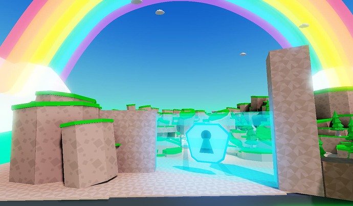
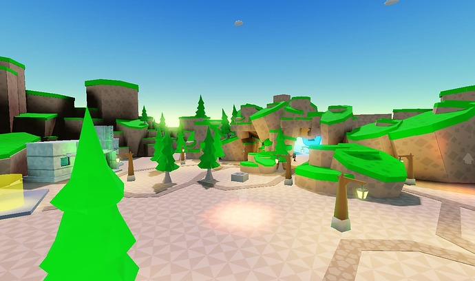
Can anyone point out what else to add or anything that should be removed! for this map
Ok here are some stuff you can improve on
- The map is very bright try darkening the colors
- Add some textures
- Why are the trees a darker shade than the boarders? You should have the same color. Same goes for the floor
- Why is the map so small compared to your character?
- Try adding more clouds.
- Add more variety to your borders. Ex: rotating them, changing their size, etc.
There’s a lot of room for improvement so I’ll let you decide what you need to change on based on that. Good luck!
ty for the response, i will make some changes and update this post once I am done;
thanks for taking the time to reply much appreciated
hi,
what do you think about those new screenshots of my simulator map?
I have created 2 buildings? what’s your opinion? anyone?
Sorry for the late response, but I think it’s much better. I like the textures. Only thing is the rainbow is too bright and you could try lightening up the textures by making the textures more transparent.
Here is a good idea add worlds so people can play in more areas.
@SilentSuprion
np, ty for the response, much appreciated. I have made the clouds and rainbow parts a little bit transparent.
@aiden0611s
thanks for the suggestion, I indeed have the idea to make more maps(one by one) for players to roam around; after finishing this one.
@LegendPX_Taken Hope to see your game on the popular page!


