So I have made this simple GUI for my game for modifying disasters and It works.
The thing is that I’m not really happy on how it looks. I’m not the best at make UI for games, and I came here for suggestions/help on what I should do to make it look better!
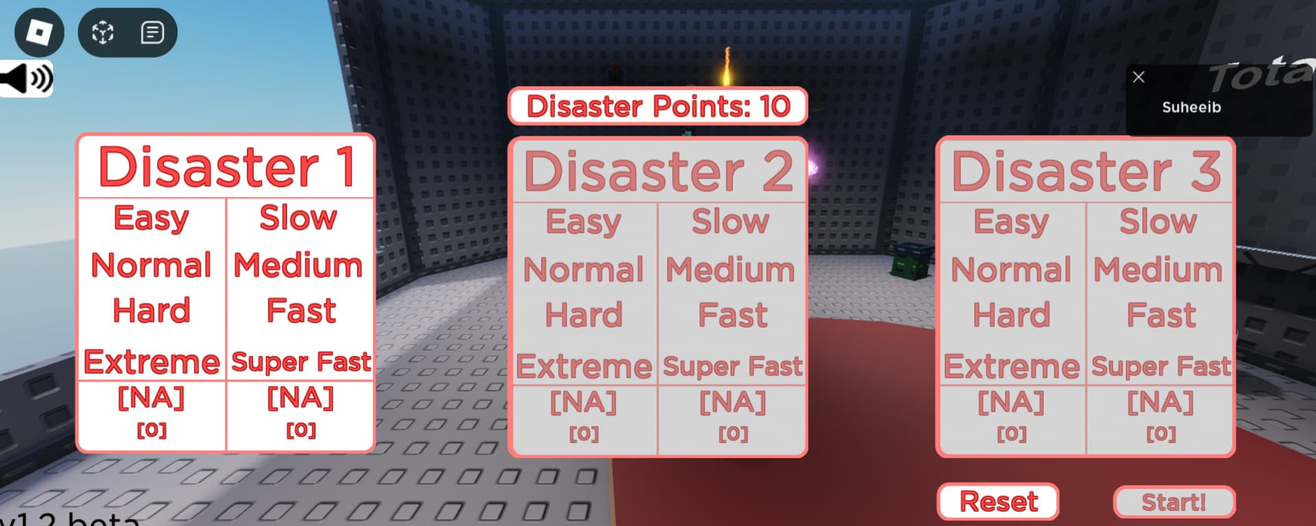
I’d probably recommend making the background not as bright. Maybe try to find a nicer shade of grey that does not clash so much with the red. (Or maybe make the stroke slightly thicker and darker, not too sure)
Also maybe some font or colour variation between different elements?
Add some more bars to seperate the difficulty options.
Not sure what the numbers at the bottom mean but if you’re supposed to be able to in- and decrease them maybe add some arrows to the right and left of them for that.
Other than that, consider changing the colours. White and red really spring too much into your eye, so maybe change it to some calmer colors (blue, green, grey, dark red, etc.). : D
Maybe put “DP” (e.g. “10 DP”) on the right of it or make a Disaster Point symbol : D
Also a “Cost:” (e.g. “Cost: 10 DP”) on the left, although at some point it might get too cluttered up, so see how it looks for yourself!