Just to be extremely clear: using a plugin is not recommended (by me, at least) even though most developers use it.
I have to actually fix GUIs made by other members in my team because they don’t know how to edit the properties and instead just use the plugin.
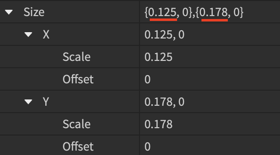
In addition, converting item sizes to scale is not necessarily a good thing. It makes text impossible to read on mobile, and it ruins the experience by making huge buttons for large monitors. What you should do instead is use offset with a centered anchor.
A general rule of thumb is that if the UI item does not exceed 15% of the screen, make it offset.
AnchorPoint is a Vector2, not a UDim2. Your explanation is fine, but it is hard to read.
Anchor points determine where the Position property affects the UI. Simply put, it is the scale-based origin of the UI, represented by a square point visually. An anchor point of 0.5, 0.5 would center the UI into the position. There’s 8 you need to know:
- Top left 0, 0
- Top center 0.5, 0
- Top right 1, 0
- Right center 1, 0.5
- Bottom right 1, 1
- Bottom center 0.5, 1
- Bottom left 0, 1
- Left center 0, 0.5
Man, we really need a scale constraint for UIs. Why do we have to script that?
Anyways, in OPs case, they would want roughly:
- A position of {0.5, 0}, {0, 150}
- A size of {0, 300}, {0, 70}
- An anchor point of 0.5, 0
This should be ideal for most screen sizes; however, I would strongly recommend redesigning your UI so that text like this does not use offset. There are some pretty small screens out there that might not support 300 pixels wide. You might want to make it scaled to {1, 0}, {0, 50} instead, and place it closer or on the top bar or the bottom of the screen. This would be ideal.
I’m just making sure you won’t pick up any bad practices since they’re hard to grow out of.


