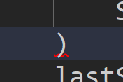
There is a syntax error on this line, but its barely highlighted with a red underline on a single character and the text is on top of the underline making it even harder to see
Gotta support this one.
For developers with visual problems like me, this would be a great QoL/accessibility feature.
Catching errors and small typos like this would be amazing, right now it’s extremely annoying to try and find tiny errors like this in the editor.
The scrollbar on the right tells me there’s an error somewhere, but trying to find the exact line with the error takes me time. I’ve tried adjusting the color of the error highlight and changing fonts, but for one character errors like this it’s still only barely visible.
Zooming in, the highlight is actually behind the main script editor text, and barely under the line.

Compared to how the devforum editor does it:
![]()
It’s very easy to see, and the main difference is that the underline is much more pronounced and spaced further below the main text.
The other reason for the ask is that errors like this aren’t always easy to catch in testing, and that’s very frustrating. Having to load up the place and doing stuff only to find out I’ve made a small typo somewhere…
Maybe making the error highlight more pronounced like ^, or something like highlighting errors instead of underlining them?
Script Analysis under the View tab should give you a list of errors, hope that helps!
It does! I also just realized light mode works better for my eyes, but this is a great accessibility feature nonetheless

