Hey!
Would love some feedback about these gamepass icons.
How can I make them better too ?

5 Likes
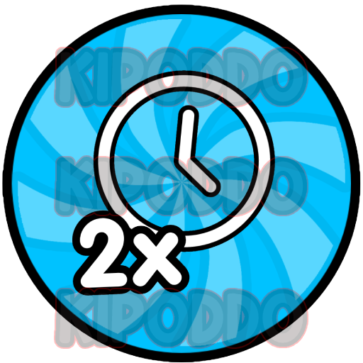
From a design standpoint they’re very simple, bland, and can use more effects.
From a marketing standpoint they don’t really opt me to buy them, more vibrance and imagery instead of a flat vector would be better. ![]()
5 Likes
They look good! If you want to try some new stuff maybe try adding highlights, outer glow, and any enhancing effects, especially on the star icon, since you’d expect a star to be shiny and dazzling ![]() but overall these look clean and nice!
but overall these look clean and nice!
2 Likes