Most things about this interior feel off to me and I can’t wrap my head around what it is - everyone please be brutally honest on what should be changed or added or if it’s good as is. This game is meant to be a horror game about possession/demons/exorcism, and this is the “house players are staying at for the weekend”. Probably need the most feedback on the “??? Room” (not even sure what to call it really)
Before you read - don’t get me wrong, I think the models and look of everything individually actually looks amazing, it’s good work, take what I say with a grain of salt (I tend to exaggerate a bit!).
So, what I feel may be giving you these ‘off’ feelings, and I’m getting it too, is the materials, the colours, and the décor:
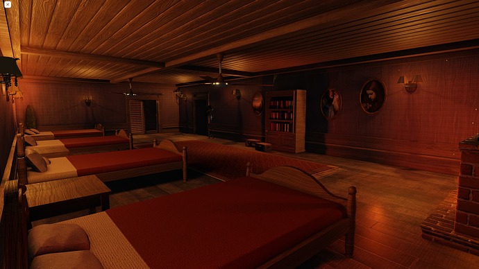
??? Room (perhaps the Common Room?)
The texture on the walls is like an illusion, it’s confusing with the way the wood lines intersect with the other lines, it almost looks like fabric.
The floor, walls, ceiling, furniture all have almost the exact same colour. There should be some differentiation between these, make the seats a little darker, and the floor a different shade, otherwise it can be confusing to look at.
–
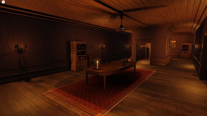
Living Room
The chairs at the back to me look like they should be made of fabric, not wood, they are the shape of lounge chairs but the material of dining chairs.
Additionally, the tables in front of those chairs are half-on-half-off the carpet, feels a little disorganised.
–
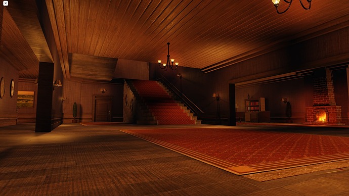
Entryway
There are a lot of different directions of the ceiling, it suddenly stops before the stairs where it could continue on the left, or perhaps be a rounded/bevelled balcony.
There’s a small carpet in the middle of the floor not the same size of the floor or with anything on it, it’s just there.
–
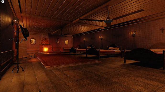
Bedroom
A little much going on at once - a fireplace, and a shelf in the middle of the wall, and a hat stand, and paintings fluctuating in height, and wall lamps, and ceiling fans (which are a bit low), and boxes. It just feels a bit scattered and a lot at once.
–
And for all rooms I think you should differentiate the floor or ceiling colour or both, organise the items (e.g. a shelf will usually have at least 2 sides against a wall if not next to another shelf), and possibly the lighting all being orange might be to do with this feeling too. Lighting has a big, big influence on atmosphere.
Good luck with future development!  This game looks and sounds interesting, I’d love to play when it’s out, I’m a big fan of horror.
From what I see, it looks pretty. I’ve played multiple horror games all over Roblox and even managed to spectate their development stages, and I genuinely second those types of games. I am not really good at criticizing, so I guess I will just end the feedback here. Keep it up.
Wow, overall looks really good. You asked for honest so here’s my opinion. That’s alot of wood and the place looks like it has been there for a long time. With that, your ceiling fans look too new/modern for that place. Plus the ceiling bracket or ceiling plate seems too small. The overhead lights in the entry seem too small and not grand enough? for an entry. The ??? room could be turned into a library but the bookcases you have made seem small or maybe some more trim added to the top would help. The lights themselves plus the coathanger seem almost too reflective to me.
All that is just my opinion and taste. It really is a very nice build and I get the feeling of cabin/lodge. Very good.
I like the build, it gives me doors vibes while also being sort of unique. Keep up the great work!
By looking at this build I get the feeling that there is a lot of empty space, and some of the furniture feel like fillers.
I also noticed that some areas are weirdly lit while others are well-lit. The place it is noticeable the most is the living room area.
Windows don’t bite, kill, or harm… Just in case you were wondering, it’s safe to add them =)
couldn’t agree more thanks for the feedback; i’ll definitely try out some windows


