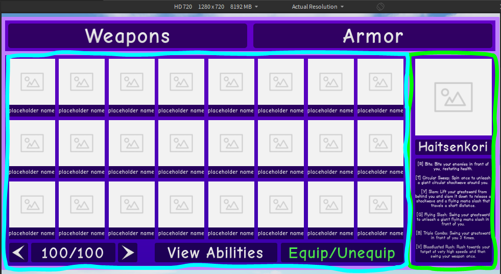
There’s a part of the UI at the bottom which I made display the weapon’s abilities. I might make it so that it display’s the weapon’s lore description.

If you look at the abilities (red) and the lore description (blue), you can see that they’re barely readable on 720p. I made 1280x720 the minimum “supported” resolution.
I’m thinking about how to improve this.
Should I make the right side a scroll frame? If yes, how will I make the scroll bar fit without ruining the design? If there’s no visible scroll bar, how should I let users intuitively know that they can scroll?
If there’s no scroll frame, what should I do with the “View Abilities” button (doesn’t work right now)? Should the UI that appears when pressing it cover the grid of placeholder names? Should it cover the right side (view specific weapon portion, has the word “Haitsenkori”)?
*for those who are smooth brained, teal is the left/grid, green is the right side