I have noticed that many developers on roblox go through the troubles of creating images outside of roblox and then importing them when they could easily achieve similar results inside studio, so I made this tutorial to explain how to do so. This is my first tutorial post so im open to suggestions on formatting and ways to improve the post. I have linked the classes documentation for the first time each is mentioned.
What will this tutorial achieve?
You will learn how to make borders, rounded ui, gradients and more through designing a shop ui (no scripts yet).
Before you start
While this tutorial is fully vanilla friendly, and I have included the vanilla code for plugins I linked, it is useful to have the following plugins:
All the sizes and properties will also be listed below the tutorial.
1. Planning out / creating a base ui
This first step to creating a UI is to plan it out. Have a sketch of it or at least and idea of how it should look. In this tutorial you will be following my design so you can just start building. We will begin by placing a frame in a ScreenGui in the StarterGui. Then scale it like shown in the image (does not have to be exact), and name all the Frame and ScreenGui relevant names. It will serve as the container of the UI and will allow to animate the whole UI with just one object.
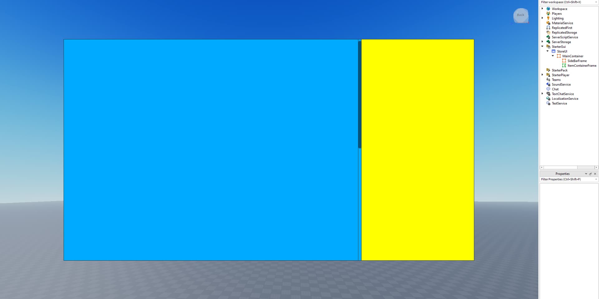
Next, Add a scrolling frame and a frame inside the first frame. I have recolored the second frame and scrolling frame to yellow and blue so you can see.
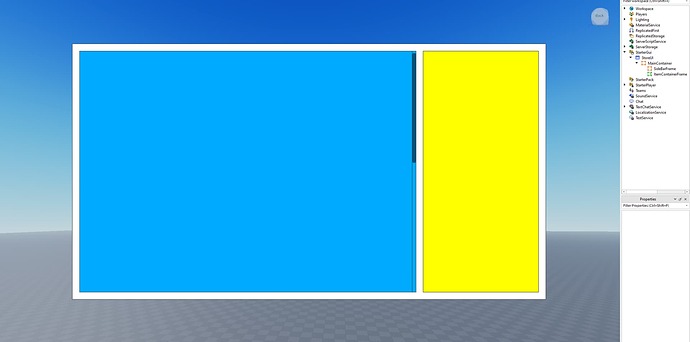
If you wish, you can have a margin between the main container GUI and the two UI in the middle, it will look like this (Hint: create temporary frames with a specific offset size to accurately measure space between borders, In mine the space is 24px):
And that is it for the base UI. Don’t decorate it just yet as we will first want to lay everything out first.
2. Adding the container contents
Now we will add all the items that will be held in the container. These will be shop items and a display at the side. First, go into the scrolling frame and insert a frame. I have colored mine purple so it is easy to see. Scale it to the size you want and then *Convert it to scale (instructions at bottom). This is how it should look like:
Next, copy this size and then insert a Ui grid layout object into the container frame. Set the call size to the copied frame size. If you want spaces in between cells and border like mine then add a Ui padding object to the container and set its padding for all sides (do this with scale values). Then, set the same padding for the ui grid layout cell padding. Finally you can duplicate the sample frame and it should automatically fill a grid shape! Here is what it looks like:
Next you can add text buttons and image buttons inside these cells to make them like a shop! You can also use the sample Frame’s layout order property to order them specifically.
With the item list done, we can now move onto the sidebar. You can add and arrange any UI object (remember to *convert scale when done) Here I have used (in Y position order) a image label, a text label, a text box, and two text buttons.
Now, *scale each object so far (we have already scaled the grid objects so ignore it, however scale the containers and the sidebar).
3. Decorating the UI
Having setup all the ui objects, we can now move onto decoration. I will start by inserting a UIstroke object into the main container frame. Make sure the stroke type is border, and then configure as you want. I have set my thickness to 5. If you want your border to have a gradient then set the color to white (255,255,255) since I will reference this later. If you want rounded corners insert a ui corner object. This is how it looks like:
Next, I will set the background. I will go with a rgb on black design so the background of mine will be black. You can configure this by changing background color on the main frame (as with ui stroke set it to white if you want a gradient). I am happy with my current design so I will now replicate it to the sidebar and shop containers. The layout and design should look like this:
Now for the gradients. You can add these by adding a UI gradient to the UI object and the gradient will render where the background is (or the line in the case of the UI stroke object). I will create a rgb gradient and my result is:
Finally you can assign this design to all the objects using the same methods. Hint: can customize the scroll bar by adding color or changing its image. As well you can change text color, font, text size and even add ui strokes to text by setting the stroke type to contextual.
If you want to use a image label instead of a frame you can easily do that by copying all its properties and children over, or in the case of a scrolling frame you can set the frame’s background transparency to 1 and then have something behind it (make sure the frames zindex is higher).
That is all for this tutorial, here is my final result:
*How to convert to scale or offset?
In order to fit all devices, it is good practice to convert most ui into scale size so that it will render based on the screen percentages rather than a certain pixel offset. In order to convert between then you can do the following:
If you are using the autoscale lite plugin:
Press unit conversion from plugin tab and convert both size and position to scale or offset (whichever one was referenced in the tutorial) while selecting the object. If the UI size changes then press ctrl+z to undo and press add constraint before scaling. If there is a text property in the object, then click the scale text button as well.
If you are using vanilla studio (no plugins):
Use the code in this post to scale (you can create your own local plugin by reading another tutorial or create a module script and call it while running to copy the scales)
If that is too complicated, you can manually convert to an estimate of the scale size and then tweak it until it fits.
To add constraint, Add a constraint object inside the UI object you want to constrain and then set the value to X/Y of the UI object.
To scale text, set the text to scaled and then add a Ui text Size constraint with the min value of 0 and max value of the text size.
Final Notes
As I mentioned earlier this is my first tutorial and it took over 2 hours to make. I will be coming back and revising it over the next couple days and I hope some of you find it useful. I have linked the game with the UI here and made it free to copy however please change it up a bit rather than just copying the exact same design (the design for this is copied with permission from Paintball The Flag). The products in the example are just donations, and I’ll make a tutorial on scripting the shop ui if this tutorial does well.
A YT version will come out soon so I will link it here when it does.
I would love to see what anyone has created from this so if you used this tutorial send me a message or mention me in your post. And if you need any help, I will be glad to assist.


