I’ve made a leaderboard UI that operates on local script only, how can I improve if I can? And what’s your overall opinion?
Before changing team:

After changing team:
I’ve made a leaderboard UI that operates on local script only, how can I improve if I can? And what’s your overall opinion?
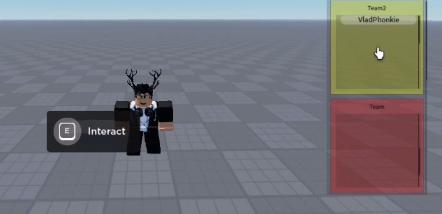
Before changing team:
After changing team:
I think it looks good, but when there’s one player in a team, it’s as big as if there were more players.
And this is not necessary. The leaderboard could be reduced if is only 1/6 players in team.
How can I do that? I’ve never knew you can do that. If so you’d be kind enough to say how to do that I would appreciate.
Okay, but basically it will be a little more complicated for scripting and I would also like to send examples, but it can’t be done on mobile (and with translator) . First of all, you will need to calculate the size as it should be according to the number of players in team. (one nametag size Y + offset (if you have a space between each name) * number of players in the team.) That’s for 1 team. The same for all teams, and then set the size. Read about UDim2.New() . Then it should be done. Only if there are more players than limit… That’s going to be more complicated too, and I can’t explain it. There is also an easier way, only then the leaderboard would look a little different. When I find time, I’ll send an example.
That looks very good! Make the transparency a bit lower so people can see the GUI itself better.