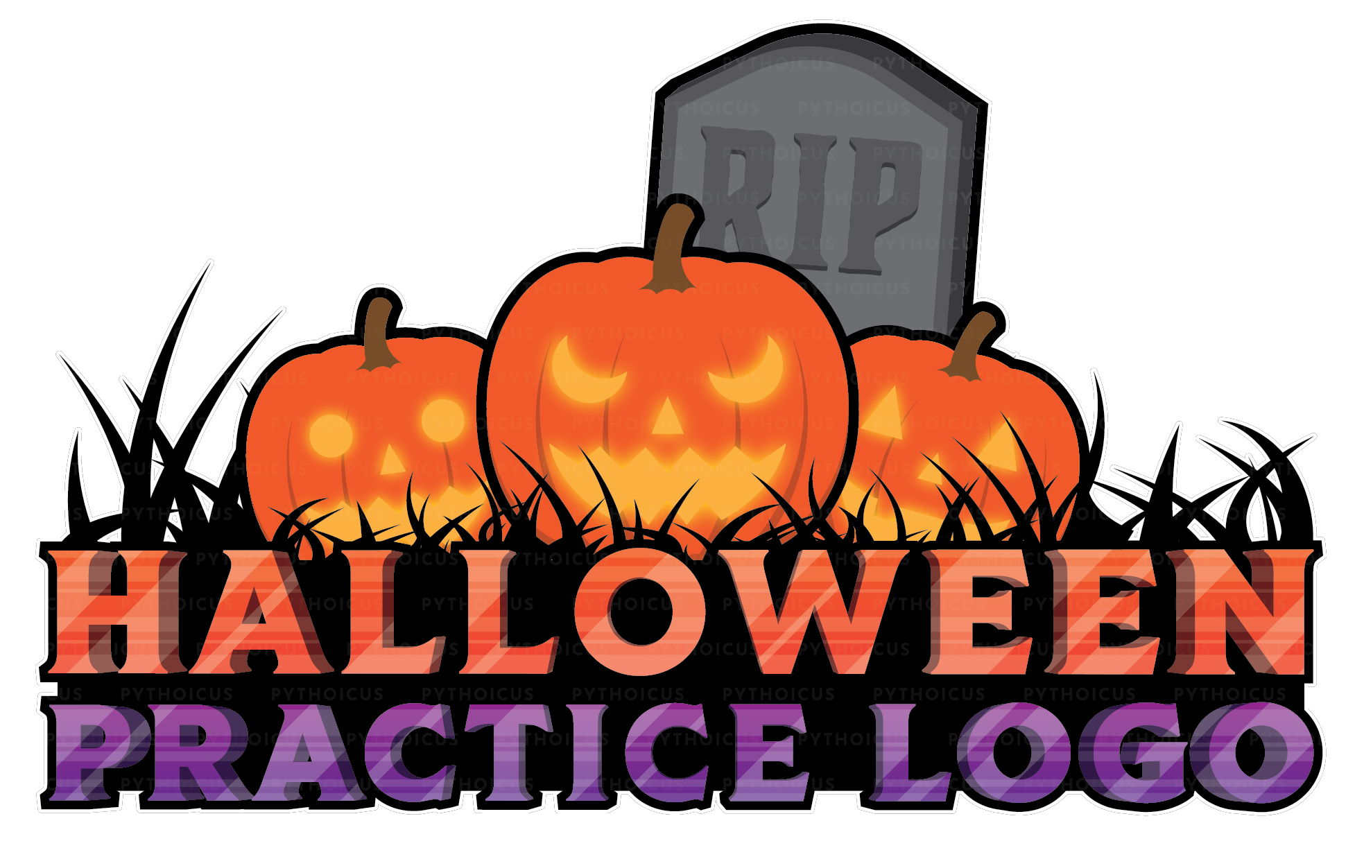
Hello everyone! I’ve just created a practice logo for Halloween, and I’m looking for some feedback. Feel free to let me know if you have suggestions, advice, or just want to comment on it. Constructive feedback is greatly appreciated!
I may not be an artist but I think carved pumpkins would fit the halloween theme better. In other words, a bit variation in the pumpkins could be good. The logo looks great.
Looks great, I love it! I would add more contrast to the pumpkins, since you got a whole light and dark theme going on with the text. So perhaps more ingraved carvings/darker lines on the pumpkin?
Thanks for the kind words and the suggestion! Adding more contrast to the pumpkins to better match the text contrast is a good idea, which I’ll definitely keep in mind.
This looks pretty good, and I really like your revised version a lot more! Your logo is very refreshing on the eyes as it doesn’t use excessive lighting and details are kept to a minimum though each little one adds to the logo overall. I like that your revision includes a tombstone and carved faces on the pumpkins as well!