Hello! This is my new build about a simulator map. I choose to make it low-poly style and I want to achieve cartoon style. How can I improve it? (Lighting) This is the picture:

Thank you!
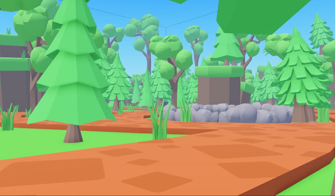
Hello! This is my new build about a simulator map. I choose to make it low-poly style and I want to achieve cartoon style. How can I improve it? (Lighting) This is the picture:
Thank you!
Not gonna lie but the color palette is a bit plain… everything else looks fine though!
Could use a bit more color variation tho
Fence is a little weird. Put water in the fountain.
Too many trees tbh. Just decrease the amount of trees a bit. Place a statue somewhere as well.
Seems really plain, like the dude above me said
As for lighting, well, its good for a simulator map.
If you want realism, set the Clocktime to 6:45, change the colour to orange, add some blur, add color correction as well
For the trees, make some darker as it would look better and not heavily plain.
Cool, but add some benches as well, and a fence. Maybe add a small house somewhere.
Also, place the statue on top of the fountain, if possible, like in PLS DONATE or MM2.
Add some street lights at some places, it will give a good vibe at night.
Also, mind telling me what type of sim this is? If this is a lobby, some houses and other structures are necessary
Space the trees further from each other a bit (Sometimes they’re too close)
Also, can you give us a bird’s eye view of this map?
Very good! If I were you, I would’ve put some small house toward the side though, there just isn’t that much in this map.
Place the fountain in the spawn as well, like most games!
Bonus: Add some NPCs cuz why not?
THIS IS AWESOME!
Good job mate, taking a gander around your map, this looks much better than before. Other than improving the quality of the streetlights, I don’t have much criticism. Good luck!
I mean it’s so good for simulator game but remove some trees because there’s too many.
I can agree with @Stickmanfanrdc its better then before now nice work
Very good! Maybe it could have different colour variations but other than that great job!
I’m just curious- would it look better if the map used materials? Like the grass using Grass and the dirt using Ground?
Cuz I want to make it low-poly?
Low poly means that it has a low polygon count, not the reduction of materials for realism.
Though, I can see your point.
Everything looks like it’s from a asset pack. The path looks a little too orange for me, I think a very beige color would look fine. I’d recommend modeling your own assets though, since that’s how you improve in building. I think a texture on the baseplate of grass would make it a little better. Other than that, great job! 
The trees color make dark green and light green combine them in 1 tree it will be not plain ![]()
Nice work keep it up!
Awesome! But put the fountain in the middle of the spawn area, where the tree is now. I think it will look better.


