If you want one it’s only 5 Robux. Uh, just add me xD!
Profile! Godtastic - Roblox
This is not the only one by the way! I made more but I guess I can’t upload them. Ill just send the groups I made for them. (DONT HAVE TO JOIN THEM)
https://www.roblox.com/groups/7140718/chazs-fan-group-D#!/about
https://www.roblox.com/groups/7322055/The-BAW-Family
https://www.roblox.com/groups/6479287/The-Godtastic-Squad#!/about
This is some intense artwork you got going on.
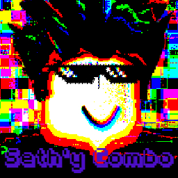
For the first one, the text is difficult to read, as the outline blends in with some of the background elements, and the text itself is transparent.
The others, though… I mean, it appears to be your art style, so I can’t really say anything about how “noisy” or high-constrast they are. Image effects aside, the last three thumbnails have good character placement, so good work on that.
Hope this helped!
Thanks really helps! I don’t know I like noisy. But I’ll improve on the text for sure! Thanks man ![]()
I think these logos don’t look good. They are too bright and they have too much contrast. I’m having a very hard time reading them.
Overall, they don’t look that good. Just by fixing the colors a bit, you’ll be surprised how much color can really change the way a logo looks. I suggest searching up “Color palette” online. You can find a really good website that I often use for my builds here.
I like these. Did you use Pixlr by any chance? That’s what I use to make logos.
Yeah I’ll work on it. I’m trying to do GFX. But I’m bad at the moment xD
I like the weird, pixelated, high saturation style that you use. I think it’s really cool looking and unique. One criticism I do have for this is the lack of contrast from the text to the rest of the designs. You should make it a unique color that doesn’t appear in the background so the text is unique and doesn’t blend with the rest of the background and is easily seen.
Really Cool for 5 Robux it has a Special Style!
Same I use PIXLR. It’s expensive photoshop. Thanks a lot man ![]()
Try Pixlr. You can make stuff like these in a couple of minutes, and it’s FREE!
Link to Pixlr: Online Photoshop - Free Photo Editing Tools | Pixlr. You can use any version.
Ok… I don’t know why you advertised this without context or feedback to another comment…
Thanks man! I know my way around pixlr xD if you want one just add me on discord or ROBLOX
Discord - God_Durp#8549
ROBLOX - Congo - Roblox
Thank you! Add me if you ever want one xD
Hello, the image is good. I just have some things mentioned below that I noticed about the image.
I hope this helped you, especially your development of your game.
Oh I’m working on the game! But I’ll work on the text, I’ll make it different! But the game is just something for fun! But thank you a lot!
No problem! Good luck for your game’s future development! ![]()
Just so people know that it is out there to use.
