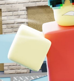
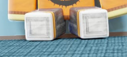
Last night I made these two GFX just out of boredom.
What do you guys think? I started GFX around a year and a half ago.
Another question: What should I price icons and thumbnails that are like these?
I am wanting to redo my commissions sheet.
Last night I made these two GFX just out of boredom.
What do you guys think? I started GFX around a year and a half ago.
Another question: What should I price icons and thumbnails that are like these?
I am wanting to redo my commissions sheet.
They should probably be around 5-20$ depending on the complexity. Also i think you should diversity your portfolio with the 3 main styles of roblox characters to increase your appeal.
These look pretty clean. I would prefer if more light was shining on the main character on the second GFX, but lesser light on the background, as a highlight on who the GFX is trying to star.
Like what @Magus_ArtStudios said, around 5-20$.
i don’t understand the three main styles of roblox characters, what do you mean by that?
You have the blocky R6 characters, the Blocky R15 characters then the arthro characters.
These are pretty good but 5-20$ is too much in my opinion, I think 5-10$ is just fine.
you think $5-$15 is reasonable?
yes sure If you work on the posing and lighting a little
how can i improve the posing and lighting, if you don’t mind me asking?
the person on the right doesn’t feel like he is oofed, unlike the person on the left.
the red person’s left leg looks like it got chopped off.
the lighting is too plain, add colors, maybea little red glow on the red guy would do
Fellow GFX Creator here.
I wanted to suggest adjusting the lighting to be a little less bright…
The lights on the walls are good, they show the texture of the wall, and don’t appear overly saturated with a bright light.
I did also notice you utilized an overlay to mimic the effect of lights bleeding onto the picture, as shown here (represented with heavily transparent streaks of white light):

The problem with having overly bright pictures is that you start to lose definition, and the detail is smoothed out.

Another issue I noticed is that when it’s too unnaturally bright, it causes objects connected close to the floor to appear hovering:

I like the posing on Nikilis, but the other two’s posing does look a little unnatural, or “perfect” to be considered killed on the spot, like MM2.
These are just my opinions as a fellow GFX creator, and I think they might benefit you.
These GFXs look very good! Nice job on them! I’d say each one should go for $5-$15.
It looks cool, but there is something wrong with the mouth
Try to recycle
![]()
i appreciate your feedback, thanks a ton!