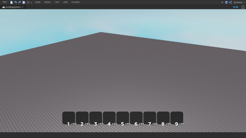
This is a hotbar for a building system I’m working on, it will use viewportframes when it is finished looking for opinions on it, and if anything should be changed
You don’t have to make the quantity text bigger but you should definitely make it stand out more by changing it to another bright color. That would definitely improve readability.
Since your game is action-based (I’m guessing), players will be very quick when looking at their hotbars, their eyes scrolling through left to right for the weapon to equip. Since you have the “xNumber” quantity indicator there, people can get easily confused with which slot is which.
Eg. Me scrolling through for my shotgun, and my brain, looking at x4 (ammo/quantity) would equip number 4 rather than say number 7 (the actual slot).
By seperating these two number systems, such as by putting the quantity number on the top right of each slot, it becomes a lot easier for the eye to see. A bonus un-cluttering and spacing out will also be a result of this switch.
You should flip the emphasis: the slot numbers should have less emphasis than the counter because the former is the information that changes the least often. Make the counter text bigger and the slot number smaller.
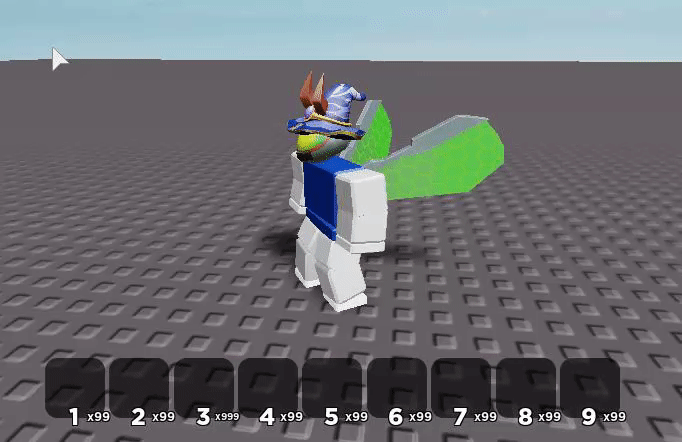
Bars from other games to compare with:
(WoW puts the keybind with less emphasis in the top corner, and the item count with higher emphasis at the bottom)
(Minecraft doesn’t even show slot numbers because only advanced users will use those and they will just memorize what is where, since they are already really familiar with the game, rather than needing to show the slot numbers specifically)
(TERA shows the slot number and the item number at approximately the same size, and actions/events that happen more frequently have more emphasis (skill reloading, reload time left in the center of the boxes))
The concept is really cool! However my issue here with the hotbar is that, after carefully enlarging the picture and taking a close look at every detail…I noticed that the “6th” box is suppose to be selected. Immediately I thought, the hot bar sure look nice, however the method of showing which box is being selected is way too blended into the others that aren’t selected. Maybe an outline around the entire box rather than around the number would be better to show the players which tool they have selected?
It’s great. Here’s my thoughts on how you could improve it further.
Move the item quantity text to above each button. It’s hard to notice it since it’s so close to the hotkey and may prove troublesome for players.
Increase the size of the quantity text and lower the size of the hotkey a bit. In my opinion it’d look a bit better since I think it’s more important for the player to see the quantity of the specific item they wish to equip (they’ll obviously memorize the hotkeys needed to equip certain tools anyways).


