The tabs at the top will have icons pertaining to what build mode category is selected. When the cursor hovers over it, the tab will expand showing the tab’s full name (would look like the tab the furthest to the right)
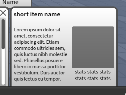
The panel to the right (item info card) will show the item’s name, description, a 3D preview of the item (dark square) and stats if relevant. This card is also only shown while hovering over an item.
If we add more categories than there is space for the tabs, you will be able to scroll or click arrows to show more tabs.
We will have the option for dark mode. If enabled, the colours will invert.
What I need feedback on (my concerns):
Can I somehow add colours while still having it look visually appealing? If so, what would be the best way to go about it?
Is the category tab UX ok? (scrolling on the tabs/arrow buttons to show more tabs)
Is the item info card too crowded? If so, what would a better layout be? There isn’t much wiggle room, but it could be made a bit wider.
This relates to the previous point, but when the item name is short, is there too much space at the top of the item info card? If so, how could that be improved? Example of a short item name:
Thank you, I’ll work on these and follow up once I’ve finished, appreciate the feedback.
Just to answer your questions/address a couple points though:
For scrolling, it would just be the mouse’s scroll wheel while the cursor is hovered over one of the categories, wouldn’t have any scrollbar
It would move out of the way
These are good points, you said it depends on the implementation so this is what I was thinking, let me know if the implementation is acceptable or if it’s still too hard to select, and whether or not it’s still considered too much movement:
The expansion and collapse of the categories wouldn’t be sequential like that, just would be a single movement
I will look into the alternative approaches you mentioned, however the only concern/question I have with the minecraft screenshot would be, would this text show up on hover, or would it be when the category is selected? The only thing with doing the second approach (when category is selected), is that I’m worried using icons wouldn’t be descriptive enough, and having to click it to see the category’s name could be bad UX. UX isn’t my specialty though so I might be wrong in that case
Yeah I wasn’t really planning on having this many categories, but who knows what the future holds. I want to add subcategories and was thinking a good place for it would be the inset at the top of the scrolling area, like so:
Scrolling: If you do it like that then I think it would be fine. (but how would it work for mobile users? could you deference between a swipe and a touch?)
Tabs: I’m still not so sure about them
If you want to move to another tab, you will think you have to move your mouse so far, however since the tab collapses back when you remove your mouse, you would have overshot the distance needed to move your mouse to get to the tab you wanted. You would end up having to go back to reach the tab you wanted.
This is a minor inconvenience and your player bases would get used to it eventually, but I think they may be better options.
Good question. You could do it either way. I would recommend doing it the first way because of the issues you pointed out with the second way. But you could kinda do both? Have it show up on mouse hover but make it stay for a bit longer because touchscreen users will have to click on them anyway because they can’t “hover”
Also
Even if they aren’t, Players will associate whatever you use as the image with the category (along as the images arent too similar). There are several instances of UI that just use images.
Here’s the UI from Genshin Impact, Those icons don’t really tell you what the button does. Some do but like half of them don’t. Either way, it doesn’t really matter because the payers learn what each button does and then they have no problem playing the game.
Cool! I do think it does croud out the top just a bit. Do you think instead of categories you could use the sortby button (I think that’s what that is) to organize the objects based on their type?


