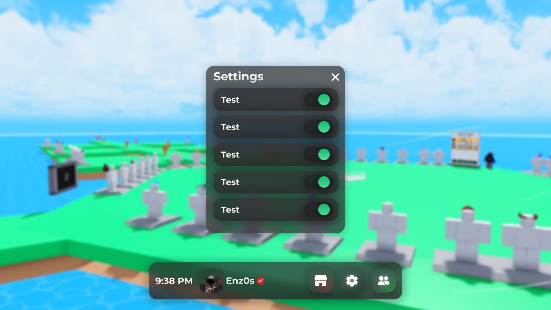
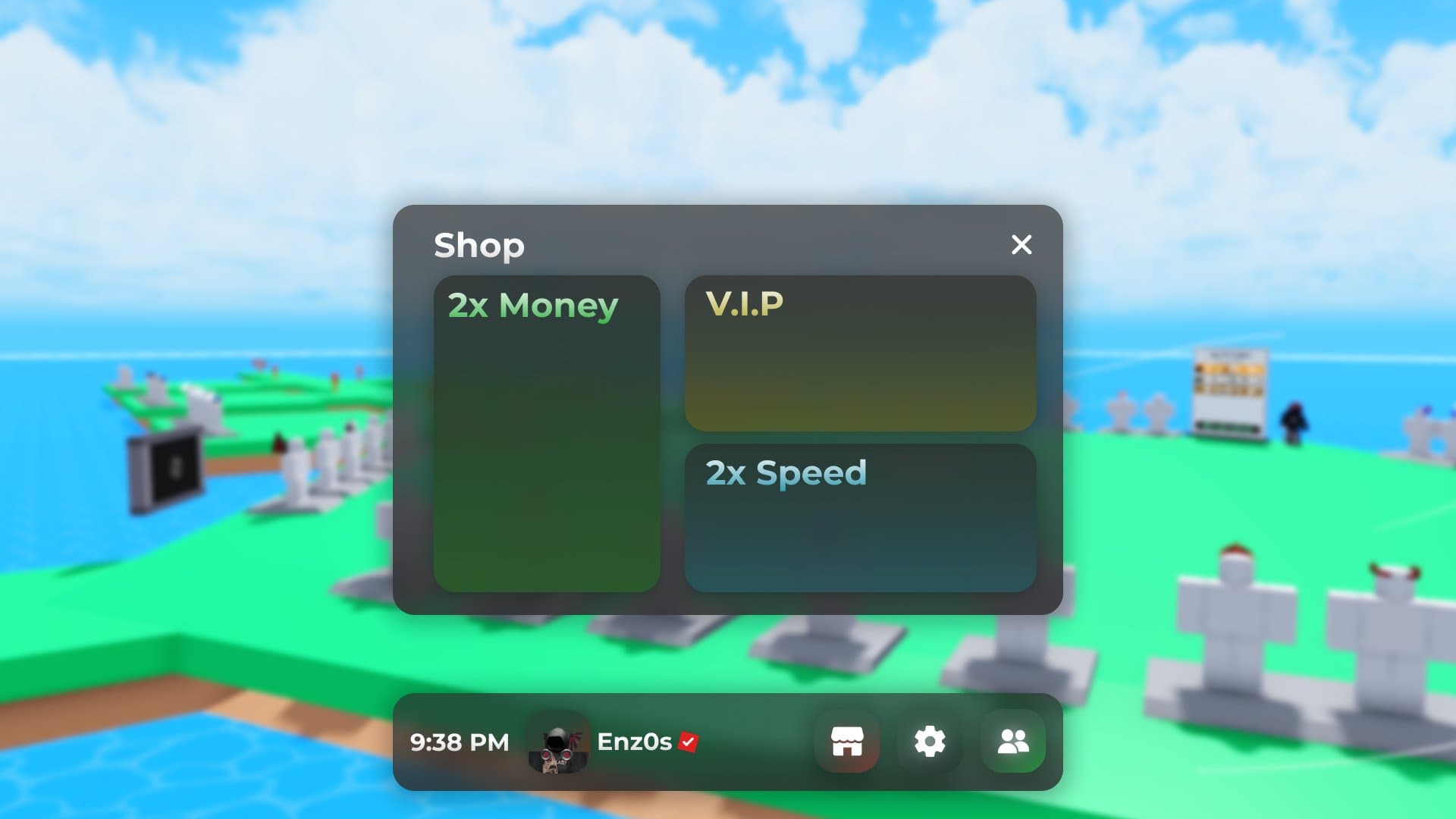
Hello i made this new ui in figma and just wanted feedback or whati can fix in the ui
**Previews

7 Likes
Not bad but I feel like the text is a tiny bit too big. Which kind of ruins the beauty of the gui. The gui is overall really beautiful but yet again the large text ruins it.
3 Likes
which text are you exactly tallking abt?
2 Likes
If only we could have UIBackgroundBlur in Roblox… looks very nice! Might want to change the scaling to be a bit smaller if this is for computer.
Also, the padding from the bottom to the side should be equal, and the CornerRadius should be half of the background here (e.g. if the backgrounds’ corner radius is 8 pixels, the inside elements’ corner radius should be 4 pixels).

2 Likes
The UI is generally pretty good, but its very… large. Intrusive maybe.
I’d shrink the player bar (The one at the bottom) be be half or less than half its current size, its just taking up too much screen space.
Other than that, very clean UI.
3 Likes
All of them. All texts are too big…
2 Likes
oh alright thank you for this ill change this rq
2 Likes

The edges are a little bit big, make it shorter. And make all sides equal, because the bottom and the sides do not have the same length.
2 Likes
It looks good! There’s just one thing, though. The padding on the left side is not the same as the right side and the middle. They should all be the same padding!
4 Likes

This UI looks great! Nice job on it!
1 Like