https://www.roblox.com/library/4457275670/Nexus-Button
At the beginning of 2017, I open sourced my Button Class from Ultimate Boxing. While it worked for the time, it had some problems, mainly due to the coupling of the text and the button. To go with a new style for user interfaces for me for 2019 and 2020, I decided to rewrite it with more of an OOP mentality. It still retains a lot of the same features, like being able to add a controller icon that is only displayed when a controller is connected.
For example, this sample code:
--Get the button factory and cut frame classes.
local NexusButton = game:GetService("ReplicatedStorage"):WaitForChild("NexusButton")
local TextButtonFactory = require(NexusButton:WaitForChild("Factory"):WaitForChild("TextButtonFactory"))
local CutFrame = require(NexusButton:WaitForChild("Gui"):WaitForChild("CutFrame"))
--Create 2 button factories.
local ConfirmFactory = TextButtonFactory.CreateDefault(Color3.new(0,170/255,0))
ConfirmFactory:SetTextDefault("Text","Yes")
local CancelFactory = TextButtonFactory.CreateDefault(Color3.new(170/255,0,0))
CancelFactory:SetTextDefault("Text","No")
--Create a ScreenGui and adorn frame.
local ScreenGui = Instance.new("ScreenGui")
ScreenGui.Parent = script.Parent
local MessageAdorn = Instance.new("Frame")
MessageAdorn.Size = UDim2.new(0.5,0,0.15,0)
MessageAdorn.SizeConstraint = "RelativeYY"
MessageAdorn.Position = UDim2.new(0.5,0,0.5,0)
MessageAdorn.AnchorPoint = Vector2.new(0.5,0.5)
MessageAdorn.BackgroundTransparency = 1
MessageAdorn.Parent = ScreenGui
--Create the background.
local Background = CutFrame.new(MessageAdorn)
Background.BackgroundColor3 = Color3.new(0,170/255,1)
Background.BackgroundTransparency = 0.25
Background:CutCorner("Top","Left",UDim2.new(0.2,0,0.2,0),"RelativeYY")
Background:CutCorner("Bottom","Right",UDim2.new(0.2,0,0.2,0),"RelativeYY")
local Message = Instance.new("TextLabel")
Message.Size = UDim2.new(0.8,0,0.4,0)
Message.Position = UDim2.new(0.1,0,0.3,0)
Message.BackgroundTransparency = 1
Message.TextScaled = true
Message.Text = "Confirm purchase?"
Message.TextColor3 = Color3.new(1,1,1)
Message.TextStrokeColor3 = Color3.new(0,0,0)
Message.TextStrokeTransparency = 0
Message.Font = "SciFi"
Message.Parent = MessageAdorn
--Create the buttons.
local ConfirmButton = ConfirmFactory:Create()
ConfirmButton.AnchorPoint = Vector2.new(0.5,0.5)
ConfirmButton.Position = UDim2.new(0.25,0,1,0)
ConfirmButton.Size = UDim2.new(1.2,0,0.3,0)
ConfirmButton.SizeConstraint = "RelativeYY"
ConfirmButton:SetControllerIcon("ButtonA")
ConfirmButton:MapKey("ButtonA","MouseButton1")
ConfirmButton.Parent = MessageAdorn
local CancelButton = CancelFactory:Create()
CancelButton.AnchorPoint = Vector2.new(0.5,0.5)
CancelButton.Position = UDim2.new(0.75,0,1,0)
CancelButton.Size = UDim2.new(1.2,0,0.3,0)
CancelButton.SizeConstraint = "RelativeYY"
CancelButton:SetControllerIcon("ButtonB")
CancelButton:MapKey("ButtonB","MouseButton1")
CancelButton.Parent = MessageAdorn
--Set up the events.
ConfirmButton.MouseButton1Down:Connect(function()
print("Confirm")
end)
CancelButton.MouseButton1Down:Connect(function()
print("Cancel")
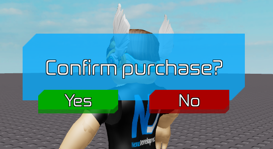
end)Creates this dialog with no controller connected:
And this dialog when I plug in a controller:

This button class is a lot more complicated than the previous version (which is deprecated now), but addresses the following problems:
- Properties couldn’t be passed through to buttons easily, leading to a lot of unneeded code
- TextLabels were always added to the button, whether they are wanted or not
- No use subclasses, like the original curved frame
With this version, the following features have been added:
- Buttons can be multiple colors. While not practical, it was needed for the backgrounds of the controller icons. All that is needed is to set the
BackgroundColor3orBorderColor3to aColorSequence. Make sure to useColoredCutFrameinstead ofCutFrameif you aren’t using the button. - Rather than mapping a single key to a MouseButton1Down, any key set of keys can be mapped to the MouseButton1 or MouseButton2 events. In the example above, pressing A or B on a controller will trigger the
MouseButton1Downevents for both buttons. - Rather than having only
BorderSizePixelorBorderSizeScale, both can be used together. - “Factory” classes are included so you can create a single “factory” object with defaults set so you don’t have to set the same properties repeatedly for several buttons.
- The code is unit tested. A lot of bugs that happened during development have been fixed.
This button will be used in several of my upcoming projects. Feel free to use it for your own.
