I know what you’re probably thinking: “well no dur you have to make it scale so it scales properly this guy must be an idiot” However, I already have a script in place converting it to offset once the game loads, it’s scale beforehand.
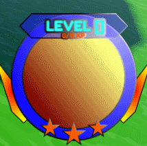
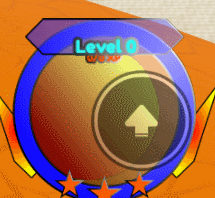
To get to the point, I am struggling with making a UI element scale across devices. Whenever I press the play button, it messes everything up. To show what I’m talking about:

Does anybody know how to fix this? It would be quite helpful!
what i’m thinking is “why didn’t this guy show us how he positioned the UI”
if you didn’t already, try using AnchorPoint {1, 1} and Position {1, 0}, {1, 0} (assuming you have UIPadding)
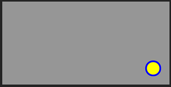
yeah probably should have mentioned that. Here you are:

I tried to set the anchor point and position as you suggested, but it didn’t work. Also, I’ve never used UIPadding before, how would this help?
i just realized that you were probably talking about the yellow circle getting shrunk when you test


this is most likely because of the ScreenGui not having IgnoreGuiInset; this would move the frames down for the roblox topbar
Enabling IgnoreGuiInset on the ScreenGui would probably fix the issue
but i have a question
if the yellow circle is inside the blue frame
shouldn’t your UIAspectRatioConstraint be inside the blue frame?
(yellow frame with {0.5, 0.5} AnchorPoint and {0.5, 0, 0.5, 0} Position)

(average phone)
(my screen; cut off some of the corner padding by accident)
Thanks for the help; IgnoreGuiInset did work.
Pertaining to your question, the blue frame scales just the way I want it to, and the yellow frame is parented separately from the blue frame because it clips incorrectly if parented to the blue frame.
The other question I had here has been solved.
This topic was automatically closed 14 days after the last reply. New replies are no longer allowed.

