The build is meant to be simple, not a lot of details, I just want to have opinions on this on if its good or not, maybe a little bit of problems I could resolve. (sorry if this is bad its my first post)
The build is meant to be simple, not a lot of details, I just want to have opinions on this on if its good or not, maybe a little bit of problems I could resolve. (sorry if this is bad its my first post)
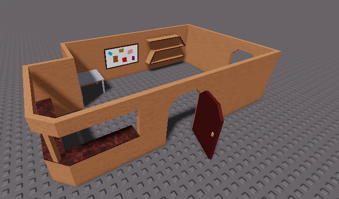
in my opinion, you’ve used the space well for the outline of your room, it’s simple but really well placed
i really like the zigzag you have on the wall, it really screams out modern – since you have that maybe try changing up your color theme a little bit (totally up to u, just suggesting it)
i can totally see this being put into a house, nicejob!!
I’m not a builder, but I think adding decorations would help, like plant pots and books on the shelf, a chair for people to sit on, and add a floor. But yeah overall it looks nice.
good suggestion, ill probably do this, thanks
I would suggest adding more height to the build.
As aforementioned, the shelf on the wall is modern, however, other designs you have used in the build does not follow the same idea. If you are going for a modern build, change the material, colors, doors, tables, etc.
I’d say it looks great for a simple build (sorry I don’t have much to critique), nice job. 
I am not a professional builder, but I just want to state my opinions and views on this with my own knowledge. If you find this offensive, I apologize, as I don’t have any harmful intention or aggressiveness meant to you.
I’ll start out with the positive points before the negative points(My opinion):
Pros:
Cons:
That is all, thank you for reading this opinion, I hope you are not offended by it, I wish you the best of luck on this build.
heres actually the full map I created using this build, it isnt done yet
The scaling of the house is definitely doable for R6 avatars, that’s for sure. It looks like a pretty good home.
Idea: The board of notes could be an interface for receiving missions, update logs, or other information.
The full map is just absolutely incredible, but this time I will keep it short
Pros:
Cons:
Other than that, nice job, I look forward on playing your game, it looks visually great, can’t wait for it!
Wow thanks, I really did work hard on it