Hello! I’m Pincafe and I’m solo developing a medieval zombie game inspired by RoyStanford’s The Living Dead.
Beta testing opens tomorrow and I would like feedback on these icons, I can’t decide which font I should use.
Thanks!
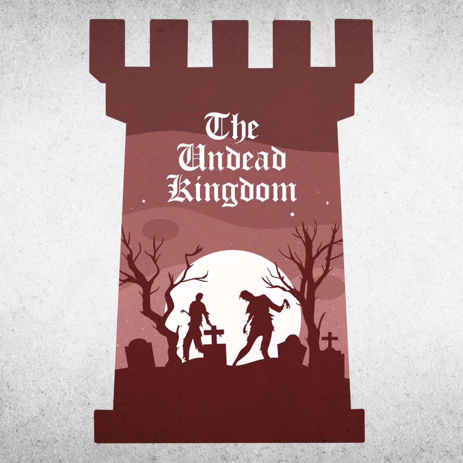
Hello! I’m Pincafe and I’m solo developing a medieval zombie game inspired by RoyStanford’s The Living Dead.
Beta testing opens tomorrow and I would like feedback on these icons, I can’t decide which font I should use.
Thanks!
I think the bottom one since it reminds me of the past, and it does suit the word “Kingdom” after all.
The bottom one with the Old English font looks more appropriate regarding the title, but you can’t go wrong either way.
the one below looks much better
everyone is saying the bottom one but personally i like the top one since it fits in a undead theme
I feel the same way, the bottom one fits a medieval theme, while the top one fits the undead theme.
I would say the top one, the text for the bottom one is hard to read for me (maybe it’s just me🤭)
I like the idea of an ‘Old English’ font but not that one in particular- it looks like any modern newspaper headline. Find something rougher and more hand-written looking that’s medieval but not blackletter. Then add the scuffed effect from the first one.