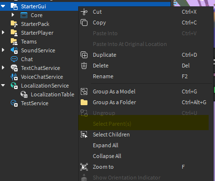
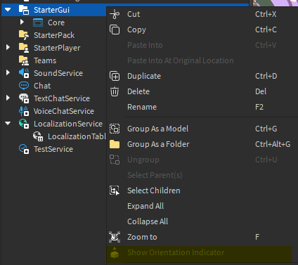
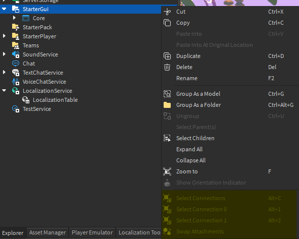
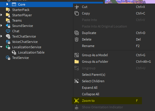
As a Roblox developer, I use the right click button on my mouse a lot in explorer. With the recent additions to the right click menu, I have noticed that it is far longer than it should be.
I am right clicking on a folder in this picture.
There are two things that should be done to fix this.
1) Don’t grey out unrelated entries, remove them.
This is pretty simple. If I am clicking on a folder, there is no reason to see “Show Orientation Indicator” or “Select Connections”.

There really is no excuse for this. I would even consider this a bug.
2) Remove useless options when appropriate.
Here is a part. I have nothing on my clipboard and the part is ungrouped, has no connections, no children, and can’t be published as a plugin.
Yet, I can still see these options.
It is my opinion that while some options like Paste Into remains visible but greyed out to make it clear you have nothing selected. However the other options like Group/Ungroup, Select Children, Connections, Plugins, etc when they are currently irrelevant is a little dubious.
Another thing that might help:
I have a script here with a part as an example. It’s in starter player scripts.

When I right-click the script, I see
![]()
This is not probably not useful and can be removed.
It would make it easier to cover up less of the screen and find more important options if the right click context menu was not unneccesarily long.
For example, when I right click on this package, I expect to see “Publish Changes” near the top but instead the context menu is filled with both totally useless and mostly irrelevant options
While I’m at it, it would also help if there was some way to distinguish these important options in the context menu, possibly with an icon of some sort or being highlighted.
TL;DR:
In any case, it would help greatly if the context menu was more concise when appropriate by at least removing options that are completely irrelevant for the selected part. Ie, don’t show me connection info for a part or folder info for a part.


