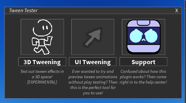
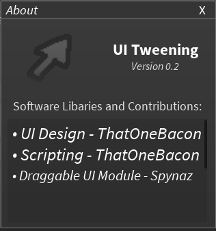
I’m currently working on a redesign of a plugin of mine called Tween Tester, mind sharing some feedback on the plugin’s upcoming redesign?

I’m currently working on a redesign of a plugin of mine called Tween Tester, mind sharing some feedback on the plugin’s upcoming redesign?

Loving the monotone color and the simple sleek boxy design, very good redesign keep it up!
This plugin UI redesign looks great! Nice job on it!
Looks good! One thing I would change is to put it in a plugin widget so when your in a script you can still use it.


How does this look now? I’ve updated a lot of the layout of itself, while adding on more things.
0 voters
It looks really good! Though the yellow text angers me.
For the second menu, you might want to redesign it to look more like a plugin menu rather than a game menu. “3D tween” could be a toggle, and “Support” can be added as a button somewhere else.
For the second series of images, you could make the easing preview match the theme. And for the export menu, you could get rid of the script type text and simply make the script or localscript buttons highlighted based off the users choice.