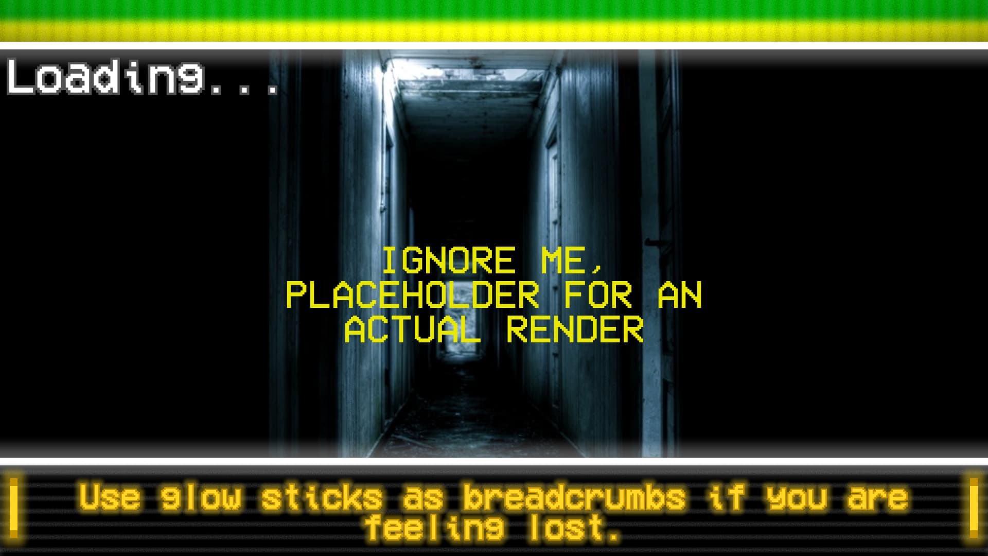
Hey! I am working on UI for a project I am apart of, I was wondering if anyone had any feedback. As you can tell it is fairly stylized. I’m very happy with the others but the loading screen I just can’t seem to figure out. These are two concepts I came up with. I was wondering if anyone has any sort of ideas.
Things to note:
-
Yes, it is in an analog horror style. The rest of the ui does use whites and blacks, with the grainy static scan lines and the same font.
-
There are two separate things that it needs to display loading at the same time.
-
The tips at the bottom would switch out, the renders in the back would switch out, and the dots on the loading would move.

Here is another bit of the UI, feedback appreciated. (Best viewed in dark mode as it DOES have a white outline.)

Thoughts?
Thanks in advance! <3