
3 Likes
I would say the background is kind of plain and boring. I’ve seen many icons that show lvl 1 and 100 which might me skip over it. Other than that, the characters are very good!
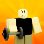
mobile game ads be like:
weight things look more like beanbags, and i dont think the 2 noobs’ emotions really look like its affecting their “strengths and weaknesses” (they aren’t really strong emotions)

o god this looks extremely cursed but looks a bit better now 
1 Like
yes it’s better now No one stops him!
Tbh the 2D is a bit weird. It would be cool using blender 
looks like an ad.
Thats all I have to say
Doesn’t seem to be an icon, it looks like an ad. Apart from that, decent!
1 Like