I listened to our feedbacks,and i say big THANK you for everyone who replied!I listened for feedbacks and reduced some bright,lower glowing effect,removed white glowing vignette
change text color and add gradient to it something like purple to pink. also change the font it just doesn’t fit the logo and somehow gives low quality simulator vibes. Also Why is text so off from the center?
If you can send me photo without the title I can make a logo and send here to give an example.
It looks better, however, if I’m honest, it still has work to do.
I’ll try my best to explain:
The Premium Icon
The premium icon is off-centred and pretty big. What you could do is make it smaller and centered aligned properly with the icon. Here’s an image of what I mean:
(You can also mess with colouring to fit the same colour accent as your whole image!)
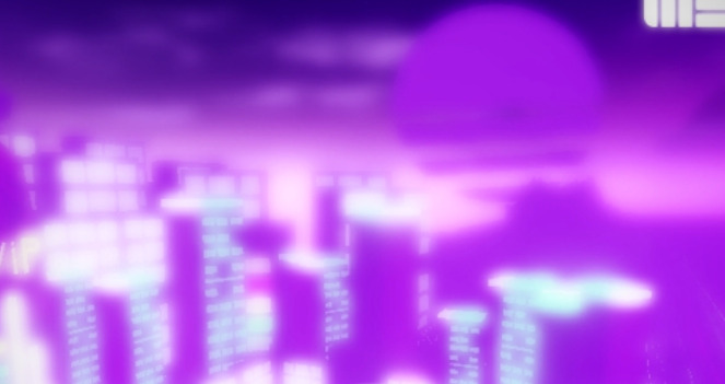
Background
Your current background is very highly exposed. You could decrease its exposure and decrease it’s bloom a little bit, so it doesn’t get washed out. Here’s an example:
Ideally, when you’re making a game, you want to make a sentence-like title rather than a paragraph-formatted title. The pink outline doesn’t necessarily fit the colour scheme of your background either. Here’s how you can improve it visually: