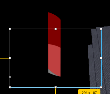
He probably mean this
without this (the area covered in red)
Yeah propably. I also thought about that. I will look if that helps.
Have you tried Clips Descendants? Please provide a little bit more info on what you are trying to do.
I want to make a HealthBar. And the red frame where I have the resizing issues with should shrink when you get damage and when you heal get bigger. But thats not the problem as I already programed that many times. But since the health bar now has that specific shape I can no longer use a frame as the red damage indicator as it needs to be the image with the correct shape. But now I cant use that size trick when programming the damage bar as the damage indicator as, shown in the video, moves out of the health bar when you change it’s size.
Do you have the full image of the Red Health Bar? I can calculate the AnchorPoint and explain it to you if you need
For example with that kind of loading bar I could use the trick as it is a frame which changes it’s size correctly.
The ImageLabel uses Rotation?
char
Yes it’s rotation is 90 degree.
Currently the AnchorPoint of the damage indicator is set to: 0.5, 0.5
I don’t find the use of Rotation good because then it messes up with all propreties and makes the UI very confusing… I’ll use a rotated version of the image because it’s alot harder to do it with a rotated ImageLabel
What i did was dividing the Height of the Image by 1 and multiply it by the Y Position that the Bar ends at
I also found problem, when you resize the Image, the bottom of the image flattens and sticks out of the HealthBar, the only way i can think of to fix this is by using the Slice ScaleType OR put the image inside an invisible frame which has ClipDescendents turned on and gets resized.

Okay I understand it now. Thank you so much. Could you send me the Roblox Place + the new asset? I can then modify the other images by myself.
I actually deleted the UI… But i still do have the Image ID of the Rotated Image
The ID is “http://www.roblox.com/asset/?id=16493955565”
One problem you’ll probably run into is that the curved bottom of the red bar will change shape when stretched, such that it doesn’t line up to the hexagon tiled container.
You might want to consider using a UIGradient instead. With a UIGradient, you don’t need to change the size or position at all and you can just change what parts of the image are visible using the UI gradient’s .Offset property.
Here is a thread that explains how do use a UIGradient for this:
(You can also use UIGradient.Rotation to make it so the cutoff line is tilted to match the tilt at your health bar’s ends.)
set the ImageRectSize to the size of the PNG
That you that solved it! ![]() But there is still one thing to fix.
But there is still one thing to fix.
When I have around 45 HP or lower I can’t see the red damage bar even though I still have some HP left, as the bar already moved too far down.
I think this may be because of the Rotation from the Gradient, but I don’t know.
Try manually setting the .Offset to find the end and start positions, then when you set the health set the .Offset to
uiGradient.Offset = minOffset + (maxOffset - minOffset)(currentHealth / maxHeath)
The problem is probably because the health bar image has some transparent space at the bottom, and the UIGradient makes that part transparent, even though there is already nothing there. If the health bar isn’t centered in the image, the rotation might mean the required min and max offsets might have negative or above 1 y values, respectively.
Could you send the code you used too?
This can be a easy fix depending on your code, if you divide the image/frame length by your max health you will get a number which we can call x, using the number x you can multiply that number by your current health and then set that to your image/frame size.
Guys I solved it! As you guys said I just had to remove the empty space around the bar. Thanks again!
This topic was automatically closed 14 days after the last reply. New replies are no longer allowed.