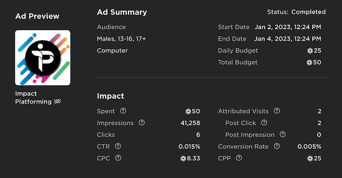
Attached is a screenshot of how my sponsorship did. I’ve gone through plenty of similar thumbnails and can’t find one that gets many clicks. Is it the game’s name? Is it unclear what the game is? I’m quite lost.
Hello there!
Personally, I believe that the icon and the name makes it confusing for players. Also, 50 Roux for 41K impressions is quite a lot. However, it is in fact ridiculous how only the 0.015 of players decided to click the ad.
Do you have any tips for making it more clear? It’s a 3d platformer that is kind of similar to Shockwave Racing.
Why are you advertising only to computer? Ad blockers exist if you didn’t know.
50 Robux is not going to get you anywhere, because the people who spent over 50,000 robux are going to get almost 1000x as much of a chance as you do of getting in the sponsored page.
It’s a sponsorship, not an ad. I don’t believe ad blockers block sponsorships. Also, it’s a computer only game, no reason to advertise to other consoles.
I obviously understand that. I’m talking about the CTR% though. I got 40,000 impressions but only 6 clicks. How much it is being shown isn’t the problem, the problem is the % of people clicking.
Well maybe your game doesn’t appeal to the eye of the 7 year olds who actually look at the sponsor section lol. Maybe try making a video on social media or try expanding your ads to other groups of people
I find that my computer sponsorships are also low, but not this low. In my opinion (take it with a gain of salt) the icon is almost too professional, it seems like a logo for a massive tech company. I personally would use a more contextualized icon, one that has ‘gameplay’ in it, by gameplay I just mean a GFX that shows the player what the game is about.
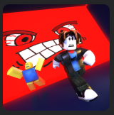
Below is the icon I am using for my game, it kinda explains what the game is about, not close enough to show the gameplay mechanics, but just enough that if a player would like to play it, they would be able to see what it’s about.

Personally if you didn’t already mention that it’s a 3d platformer, I would’ve never known what it was, therefore never wanted to play it.
Alright, thank you so much. Do you feel like the name is misleading too or just the icon?
I’d say that it’s likely because your thumbnail and game name aren’t very attention-grabbing, nor informative about the experience.
The game name, “Impact Platforming ![]() ”, doesn’t tell you much about what the game is. I can gather that it’s a platformer, with some sort of racing or time trial mechanic (based off the chequered flag), but that’s about it.
”, doesn’t tell you much about what the game is. I can gather that it’s a platformer, with some sort of racing or time trial mechanic (based off the chequered flag), but that’s about it.
Worse it the thumbnail - it’s just a logo, which is useless without a recognisable brand behind it. It doesn’t even show off that it’s a game. Plus, the somewhat minimalist style, with very little colour, is similar to that of an off-platform ad. You’ve made your game look like an advertisement, and so peoples’ eyes are just going to scan right over it.
Look at other games and see what works. Get a character in the thumbnail, make it more colourful, maybe discount some passes or products and add a “SALE” banner. It’s quite generic stuff, but it works. Also, as others have said, advertise on mobile (and ensure your game works on mobile too). If I remember correctly, over 70% of players are on a mobile device - not a console or PC
Hey, I have real experience with Sponsorships.
#1 Recently Im pretty sure they modified it, so its possible they are less effective overall (Could be wrong)
#2 You are targeting Males, 13+, Computer. This is the OPPOSITE of what you want to do.
You want to target Male Female for starters.
Its a shame they removed under 13, that could be 50% of all the audience
You are trying to AVOID Saturation, so that the Same People do not see the same ad 50 times. The more the better.
Other than that, your 50 robux is not a real sample.
Thank you so much. I figured targeting the people who typically play games like mine would be the best idea but I didn’t think about it the way you did.
Agreed. I put way too much time into making it look nice rather than look catchy. As for the name, what would I add to make it more descriptive of what the game is? I feel like with a better thumbnail, the information you gleaned would about enough for a player to decide whether or not to play.
Yeah I think I’d agree that with a proper thumbnail the name can probably stay as-is
This topic was automatically closed 14 days after the last reply. New replies are no longer allowed.
