Example:

This works for any Roblox staff member.
If you dont see it try zooming out a bit, I’m at 67% and it looks like this.
Example:

This works for any Roblox staff member.
If you dont see it try zooming out a bit, I’m at 67% and it looks like this.
I don’t see how this is a bug, you should expect this when zooming out (I assume you’re referring to a level that is below 100%), as your monitor isn’t going to be able to drive the full amount of pixels of the page.
I’m not experiencing this issue on any other icons/sites.
Here’s an example of a flair image on Meta;

It looks fine. But on Roblox it looks extremely pixelated;

And plus, 100% is way too large for most people, myself included
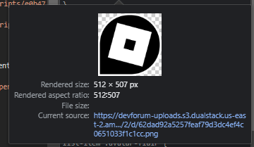
Looks like this is caused by the staff flair being a simple image. The other flairs are all SVGs and hence of course scale nicely. Your specific zoom level seems to just be the perfect zoom level to rescale poorly.
Yeah, I went and checked.
The Discourse one in my example is a SVG, while Roblox is a PNG


It is still higher quality in the prebiew, so I still dont think that it should be displaying poorly as a flair.
It’s just a worst case for interpolation / aliasing, the browser fails to handle it gracefully with that specific resolution and zoom. The best way to fix it is to use an SVG for the Roblox logo and make it the same as all of the other flairs, but the people running the forum don’t really have time/resources to do that. If you can get a good SVG for the logo in white, I can see if it’s trivial to set up and forward everything, but you shouldn’t hold your breath.