Introduction
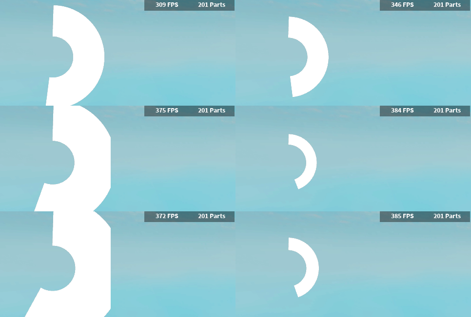
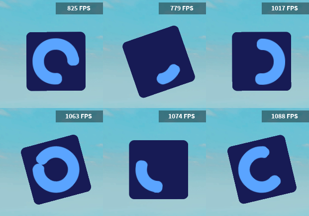
Recently I’ve been looking at scripts that make circular progress bars, but their design wasn’t appealing to me. So I’ve decided to make my own module for making circular / radial progress bars!
This module was based on AstrealDev’s Radial Progress Bar module:
How do you use it?
To change the fill of the progress bar you need to either edit the rotation property or the progress property. (Rotation from 0 to 360 degrees, progress from 0 to 100)
Or you can use the :Tween() method!
Code example
local ProgressCircle = require(game.Players.LocalPlayer.PlayerScripts:WaitForChild("MainModule"))

--Fill using loops
local LoadCircle1 = ProgressCircle.new({Position = UDim2.fromScale(0.2,0.4)})
local Speed = 80
game:GetService("RunService").RenderStepped:Connect(function(Delta)
	LoadCircle1.Rotation += Speed * Delta
end)

--Tweening
local LoadCircle2 = ProgressCircle.new({BGColor = Color3.fromRGB(23, 27, 85)})
local TweenInfo = TweenInfo.new(5, Enum.EasingStyle.Bounce, Enum.EasingDirection.Out)
task.wait(1)
LoadCircle2:Tween(TweenInfo, {
	AnchorPoint = Vector2.new(0.5,0.5),
	Position = UDim2.fromScale(0.5, 0.5),
	Progress = 90
}) -- Tweens the load circle to middle and fills it to 90% with the EasingStyle of bounce

--Animating with presets (you can try to make your own too)
local LoadCircle3 = ProgressCircle.new()
LoadCircle3.AnchorPoint = Vector2.new(0, 1)
LoadCircle3:Animate("InfSpin3")
More preset animations are provided in the downloadable Roblox place.
Is it customizable?
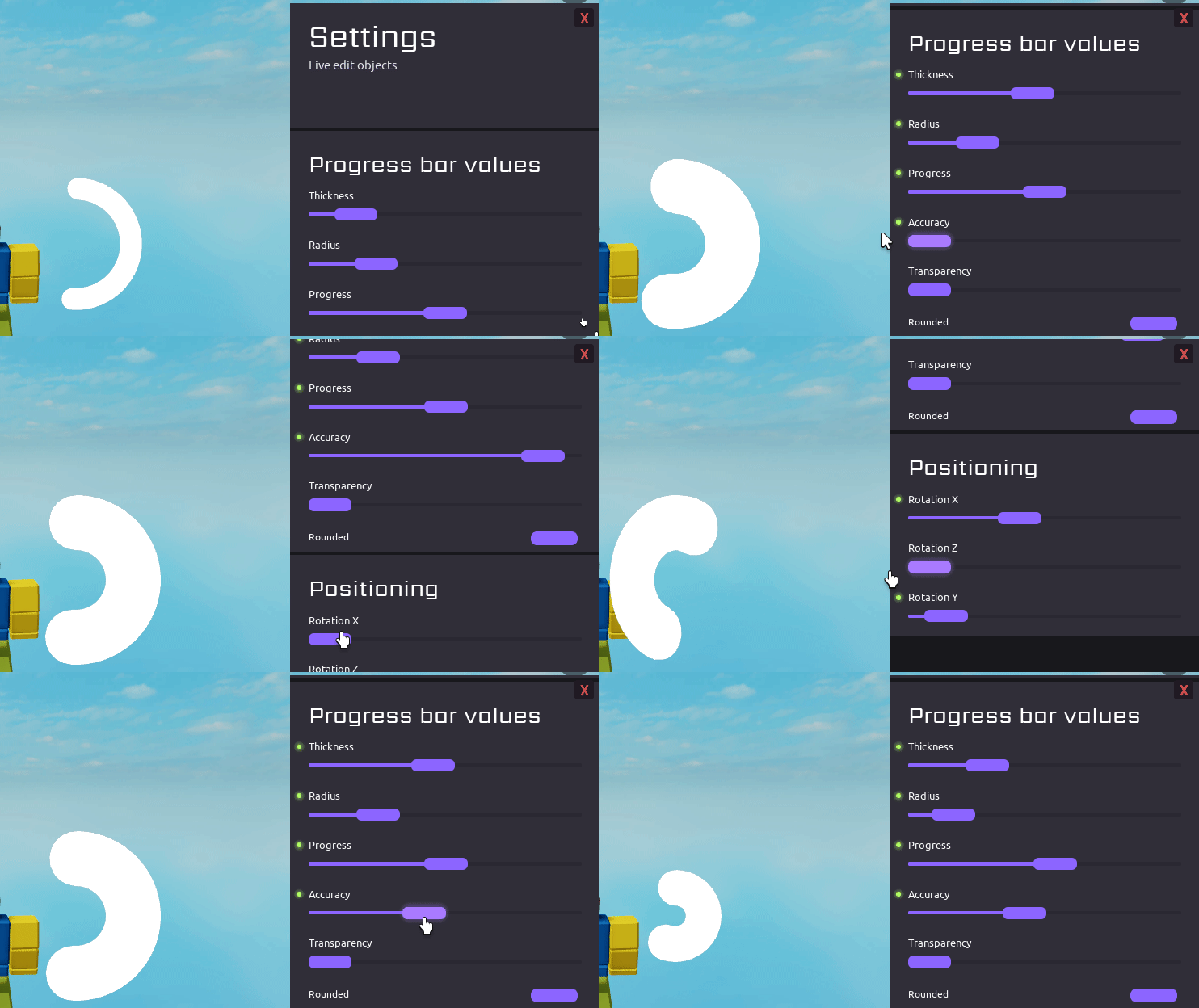
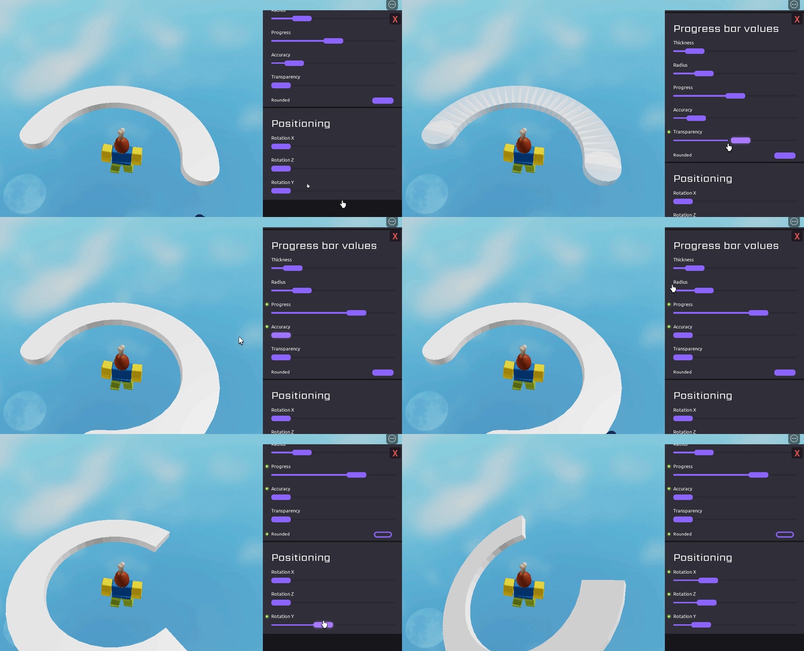
Yes it is. There are a few properties you can mess around with on my module,
you can:
- Change the color of the circle and background
- Change the transparency
- Change it’s thickness and size
- Change the background roundness
- Position it
customization examples
But can I modify it even more?
Yes you can.
If you want to edit the actual frame manually then you can do it like this
local ProgressCircle = require(game.Players.LocalPlayer.PlayerScripts:WaitForChild("MainModule"))

local LoadCircle = ProgressCircle.new()
LoadCircle.Instance.BG.BackgroundColor3 = Color3.fromRGB(255, 0, 0)
-- This will only color the rounded BG, which makes the load circle look strange
If you want to do this you should probably know the hierarchy.

Sadly it’s impossible to remove the background of the progress bar, because of the way it’s made.
How do you change the properties?
There are two ways
You can do it like this
local LoadCircle2 = ProgressCircle.new({
	Position = UDim2.fromScale(0.04, 0.65),
	Color = Color3.fromRGB(255, 69, 72),
	BGRoundness = 1,
	Thickness = 0.5
})
Or like this
local LoadCircle3 = ProgressCircle.new()
LoadCircle3.BGColor = Color3.fromRGB(23, 27, 85)
LoadCircle3.Color = Color3.fromRGB(89, 164, 255)
LoadCircle3.BGRoundness = 0.1
LoadCircle3.AnchorPoint = Vector2.new(0.5, 0.5)
Or maybe even tween and animate it!
-- New progress circle
local LoadCircle1 = ProgressCircle.new()
LoadCircle1.AnchorPoint = Vector2.new(0, 1)
LoadCircle1:Animate("InfSpin1")

local TweenInf = TweenInfo.new(3, Enum.EasingStyle.Bounce, Enum.EasingDirection.Out)
local TweenProperties = {
  Color = Color3.fromRGB(89, 164, 255),
  AnchorPoint = Vector2.new(0.5,0.5),
  Position = UDim2.fromScale(0.5, 0.5)
}
LoadCircle1:Tween(TweenInf, TweenProperties) -- Tweens the load circle to middle and changes color
Here are all of the properties and their default values.
All Properties
ProgressCircle.Progress = 0 -- from 0 to 100 -|interchangable
ProgressCircle.Rotation = 0 -- from 0 to 360 -|interchangable

ProgressCircle.Position = UDim2.fromScale(0.04, 0.95)
ProgressCircle.AnchorPoint = Vector2.new(0, 0)
ProgressCircle.Size = 0.2 -- from 0 to 1
ProgressCircle.Thickness = 0.3 -- from 0 to 1
ProgressCircle.CircleSize = 0.7 -- from 0 to 1

ProgressCircle.Color = Color3.fromRGB(255, 255, 255)
ProgressCircle.BGColor = Color3.fromRGB(30, 30, 30)
ProgressCircle.Transparency = 0 --from 0 to 1
ProgressCircle.BGRoundness = 0.2 -- from 0 to 1

ProgressCircle.Rounded = true -- if you want the rounded look or not

ProgressCircle.Parent = nil -- gets parented to a ScreenGui in LocalPlayer soon after
IMPORTANT NOTES!
- Remember to call :Destroy() when done
- It’s recommended to use the ScreenGui that the module creates instead of making your own.
(If you want to move the ScreenGui to a different directory then index ProgressCircle.Parent.Parent and set it to another location) - If you decide to create a new ScreenGui instead then make sure to set ZIndexBehaviour to Sibling
(if you need Global then read the version 1.5 notes)
How do i get it?
You can open the Roblox place and copy the module from there or get it from this link:
Get Module
Roblox place
Download Place (65.8 KB)
The Roblox place also shows a few examples on how to use it. You can find the example scripts at:
StarterPlayer > StarterPlayerScripts > ProgressCircles
StarterPlayer > StarterPlayerScripts > Progress3D
Updates
New version 2.0 | 01/21/2023
Changes:
- New constructor .fromViewport()
- New constructor .fromWorldspace()
Fixes:
- Setting the parent later will now correctly delete the default ScreenGui that was created
For more information:
Version 1.5 | 01/15/2023
Changes:
- ProgressCircle hierarchy changes
- New transparency property
- Moved a few functions to utility
- A few new examples in the test place showcasing what’s to come
Fixes:
- The progress bar now works with ScreenGuis that use ZIndexBehaviour of Sibling
(To revert to using ScreenGui Global behaviour you must first set the ZIndexBehaviour to that then set ProgressCircle.BG ZIndex to 9)
Big changes coming in the next update . . .
Version 1.5 Place (47.6 KB)
Version 1.2 | 01/17/2022
Changes:
- Added support for other TweenInfo properties for the :Tween() method
(DelayTime, RepeatCount, Reverses) - Added new :Animate() method (used for running the built in animation presets)
- Added new :Destroy() method
Important to use when you want to get rid of the load circle as it disconnects all the loops that are currently running for the progress bar (animations and tweens). - Added new rounded property (you can disable the rounded look)
Version 1.2 Place (34.3 KB)
Version 1.1 | 01/12/2022
Changes:
- :Update() method removed
- :UpdateFill() method removed
- Added the :Tween() method
- Changed the default AnchorPoint from (0, 1) to (0, 0)
The :Update() and :UpdateFill() methods were removed because with this update all of it is done automatically now.
The new :Tween() method can be used to tween any of the properties of the load circle
Thank you for reading! 


