Any criticism is welcome as long as it is constructive ![]()
EDIT (11/16/23)
I have since taken the criticism I received into account and reworked some of the models:


Any criticism is welcome as long as it is constructive ![]()
EDIT (11/16/23)
I have since taken the criticism I received into account and reworked some of the models:


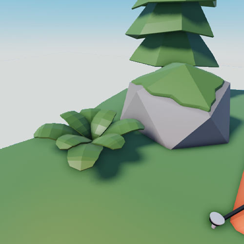
In my opinion everything in first scene look great together, but for example, stone, the grey side, has a bit too many poly compared to the green part, I ain’t expert, but it just caught my eye, maybe try out auto shade smooth only on that part and see how it looks, i might be wrong, also try it on the grass that is in the main scene and compare
Love the detail of the moss on the stone.
I think the tree looks a bit odd with the bend, maybe a slight bend would be good, but this feels a bit exaggerated.
Additionally, you could add some smaller sticks to the campfire if it doesn’t clash with the minimalist style.
Not bad, but…

Just why? That looks like broken poly to me. Either make it smooth or make low poly. Not in between.
Also I just noticed:

Broken triangle for the tent enterance.

Either make it smooth or make low poly. Not in between.
I am sorry if these things are too nit picky…
Adding onto what @NoxhazeI said, the bevels in a lot of your models are extremely unnecessary and can just be redone with the ShadeSmooth feature in Blender.
Stuff like that greatly increases triangle/polygon count and as such kinda kills the title of “low-poly” ![]()
Ping >:(
Also to OP I noticed one more thing.

This overhang is a bit unnatural and

is too pointy.
I should stop… this is too nitpicky now…
Don’t be sorry, nitpicking is what I need. All valid points; it is really interesting what you can miss even when you are the one who built the model. Regarding your thoughts on the bevel, I completely agree that I have to take a side here. Time to embrace the sharp edges.
Thanks for the advice! I plan to remodel each design and incorporate the advice I have received into my process, specifically when polishing a design afterwards. I’ll look into what you suggested and try to achieve more consistency.
Absolutely. I was definitely shooting for a more cartoonish bend to it, but it seems I went too far. ![]()
Sticks would be a great addition to break some of the uniformity that came with reusing the log model.
Thanks for your insight, I really appreciate it. I definitely overused the bevel instead of embracing the style.
These models look VERY good! I like the style of them! Nice job on this!
I think you will appreciate the new rock models! ![]()
Ah, yes it looks much better now, good job.