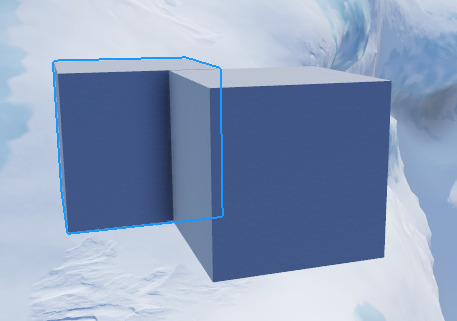
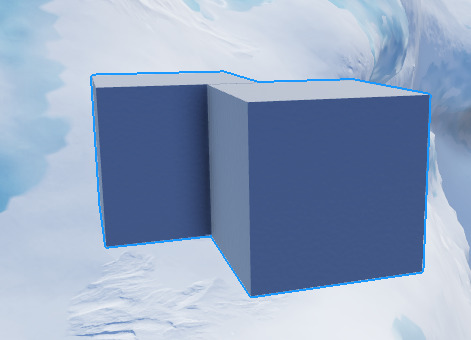
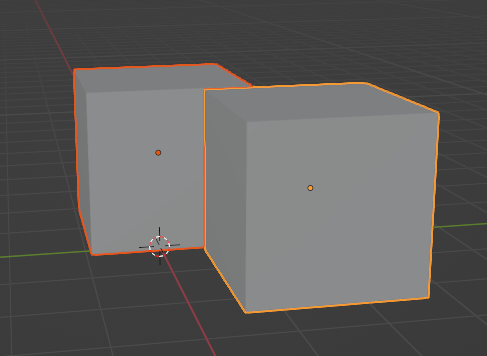
Something I’d like to have in this would be having the highlight AND the selection boxes from before at the same time. I like how you can have the highlight and the selection boxes at the same time. Some of my issues are that the outline is way too thick and as others mentioned, it’s hard to determine if something is grouped or not.
can it please just be either selection box or highlight, highlights are way to intrusive for me, especially with models.
I use a lot of textures in a handful of my places. This really needs to be fixed. You can already select the texture/decal on a part by double-clicking, alt shouldn’t do the same thing.
Even though it’s relatively new, it’s quite sophisticated, but in my opinion, this innovation takes innovation to a whole new level. For those who have been working on the platform for a long period, it could take some time to adjust to this.
Such an amazing feature. Will be so useful! Thanks again roblox!!!
Not sure if this should be a bug report post or not since this is a beta feature, but I noticed that selecting a part behind a locked part using Selection Cycling causes this error consistently:
  20:02:58.096  builtin_MoveDragger.rbxm.MoveDragger.Packages.DraggerSchemaCore.dispatchWorldClick:23: attempt to perform arithmetic (sub) on Vector3 and nil
  20:02:58.096  Stack Begin
  20:02:58.096  Script 'builtin_MoveDragger.rbxm.MoveDragger.Packages.DraggerSchemaCore.dispatchWorldClick', Line 23 - function buildFreeformDragInfo
  20:02:58.096  Script 'builtin_MoveDragger.rbxm.MoveDragger.Packages.DraggerSchemaCore.dispatchWorldClick', Line 65
  20:02:58.096  Script 'builtin_MoveDragger.rbxm.MoveDragger.Packages.DraggerFramework.Implementation.DraggerStates.Ready', Line 277 - function _clickInWorld
  20:02:58.096  Script 'builtin_MoveDragger.rbxm.MoveDragger.Packages.DraggerFramework.Implementation.DraggerStates.Ready', Line 141 - function processMouseDown
  20:02:58.096  Script 'builtin_MoveDragger.rbxm.MoveDragger.Packages.DraggerFramework.Implementation.DraggerToolModel', Line 369 - function _processMouseDown
  20:02:58.096  Script 'builtin_MoveDragger.rbxm.MoveDragger.Packages.DraggerFramework.DraggerTools.DraggerToolComponent', Line 104
  20:02:58.096  Stack End
It’d be cool if the part behind the locked part received a highlight just like how a part within a model would have when holding alt. It does seem to do it, but it’s very finicky and won’t highlight the part unless you press alt twice while your cursor is hovering over the part behind the locked part.
Outline & Hover Box:
I can’t really tell if the hover box is supposed to be gone permanently once this feature is out of beta based on this being considered a known issue:
However, I thought that I’d share some of my thoughts about the hover box and outline.
While using an outline may be visually pleasing and useful in certain scenarios, it can also be distracting. Not only that, but it also has the possibility to exclude certain information when you have parts overlapping, like telling you which parts are selected at a glance.
If I had to pick between a selection box and an outline, I would most definitely pick a hover box because it tells me more useful information. However, I do find both of them useful. Sometimes the selection box gets in the way, but it helps a lot with aligning objects that aren’t just blocks (since it is a bounding box).
I think the most ideal approach would be to allow 3 different options for displaying selection-related stuff. One for showing solely the outline, one for showing solely the hover box, and one that would show both of them.
PLEASE add this, this would make it so much easier to see models in a huge world.
FINALLY, I have had me selection box set to be such a small number for so long to avoid this issue. Roblox back at it again adding an actual useful feature instead of removing them!
Alt-clicking also lets one select a part within a model instead of the entire model.
As long as that feature is compatible with selection cycling, I support it.
Otherwise, I feel a different key than “alt” should be used for either one so we don’t lose the former.
Also, after a while of using this, I find it slightly annoying - due to the selection outline showing on top of everything. Couple this with parts being made transparent when moving them, and it becomes extremely difficult to judge distances between the object you’re editing and everything behind it. Please change the DepthMode to Occluded, or give us an option to!
You can disable the beta, but I also think there’s a setting for it in the Studio Settings.
Hello,
For those who want to still see old bounding boxes on top of the new highlights there is a new setting that you can enable in the View tab that toggles them on.
Hello @OKevinO and @YasuYoshida and @SaturnianNightmare,
Thanks for the reports we will look into this as soon as possible.
Can there be an option to have itmas, both, selection box, or highlight, because there are a few cases, like models, where highlights get in the way more than actually help.
That’s super cool, more precise selection, thanls!
Once released, can the selection outline be opt out (a setting to return it to the current system)? The current selection system is very useful for measuring bounding boxes. Selecting a cylinder rn makes it rlly hard to scale appropriately.
Credit:
Is this feature affected by the 31 active highlight limit?
I like the update, but theres a few things that I dislike.
you cant use the alt selection to cycle your selection if the object has CanQuery set to false.
the highlight has no anti aliasing.
the highlight doesnt become less visible when behind other objects, which makes it a little hard to understand whats selected and what isnt, and where the object is.

in blender, if the highlight is behind another object, you can clearly tell.

when selecting multiple objects, the highlight merges, which is slightly confusing, and i would prefer it to be like in blender.


Highligts, huh? What if I select more Instances than the Highlight limit?

