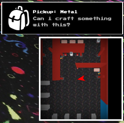
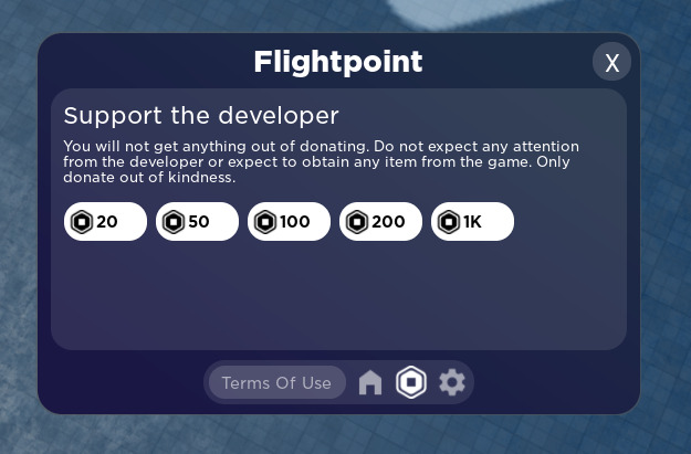
First time i made UI like this:
This looks fire ![]() Are you on talent HUB?
Are you on talent HUB?
Looks great, but I think something that’d make it better is more equal padding: the distance between the sides of the command bar and the edge of the frame are way too small compared to its distance between the bottom
i think the white and blue match the airport vibe really well and i really like the rectangle plane select frames and the plane inside them just fits really well with the ui. the wigets on the left could use a little more character imo. maybe the weather one for example could look a little bit like this one i found on google. you could probably just use a round frame for the sun. it could be more simple than this example and that would probably look better

How did you made the border animation around the button this looks sexy
This was actually answered in another topic.
I hope this helps!
Rate this ui library (should i continue making it)

Ooh I like it. It kinda looks like WPF UI
Yeah, looks nice. You should totally continue it.
Looks like WinUI3. i hope it has fluent tweening animations ![]()
My current UI in development. Wolf-Menu.
- Roblox Studio
- Photoshop
Ps: I do not own any background images used in my UI.
WOLF HUB
i really like it man, i really like it honestly.
Windows-Like Notification Ui.
Includes Animations, And is fully functional and Simple.


I Think of adding blur to the background but I’m not quiet sure
just yet. - Old
I decided it does look better with blur and i also made
an error and a warning version bc why not ![]()
First prototype for a Ui I’m making for a hangout game.
F
New Deathscreen for the New UI Update on my game “Knife Mania”
Different background Saturation for different types of notifications idea is so cool!
I forgot about this topic, since I’ve been posting updates about anything new that I create in the “waywoc” topic, but I’m back with my latest WIP GUI design.
Style: Unsure, might be cute
Software: Roblox Studio only
This is a basic menu meant for restaurants and other places where you could order food. There are two types of menus, “grid” and “list” layouts, meant for category and specific food selection purposes, respectively.
Nothing is scripted yet, but I’m trying to somewhat refine my UI design style. If you’re wondering why I’m not using external programs or images for this window, it’s because I’m thinking that I’d like to let the player edit the UI’s color scheme and use themes, just like Microsoft let users do before Windows 8.


