Literally tried to remake the basic windows 7 notifications and updates window. Pretty much old now but still amazing how i did 2 years ago.

Note its not finished.
Literally tried to remake the basic windows 7 notifications and updates window. Pretty much old now but still amazing how i did 2 years ago.
Note its not finished.
Sweet! I recommend making the tweens more exponential and fast, though.
Sweet! My only suggestion is to add more padding between Experience Name and it’s thumbnail above. Also add a little more padding between that and the experience previews below.
Thx! i’ll try to find new icons and stuff.
I’m kinda trying to learn everything because i work solo so (i got no money)
Overall super messy and lots of grammar mistakes. Way too much going on screen. I’d clean it up a lot and downsize and find somebody to fix the grammar issues, then it’ll be better.
I have made a plan to under the chat make a < seperate window with buttons for chat beta pannels admin panel party chat etc
Om the other side 6 buttons what you also can calopase like in restaurant tycoon like in some menus all buttons be replaced to quickly control the menu
For the stats it shows the level star with xp and coins and cash and other stats what you can calopase and a leaderboard toggle what come in the place from stats
In the topbar on the left side the menu button and event buttons and right toggle leaderboard and passes and subscription buttons
For reference like here in my egg hunt but remember it’s a sci-fi based game so I go for the _/ style
But for the menus what can I improve here if you want you can give me a color palette i can use also the menus be scaled down
And for the buttons around jump shall I just use the defould cas button
My main feedback point is stop hand drawing icons, they’re all deformed. Use a free icon pack like Material or Flaticon.
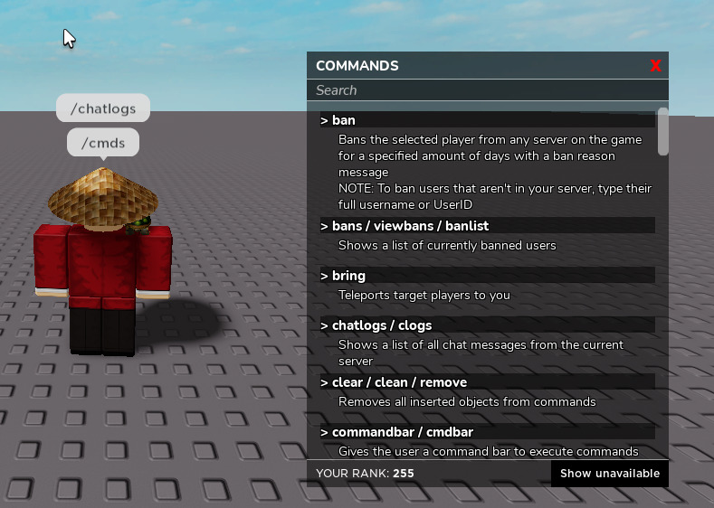
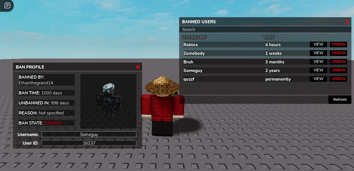
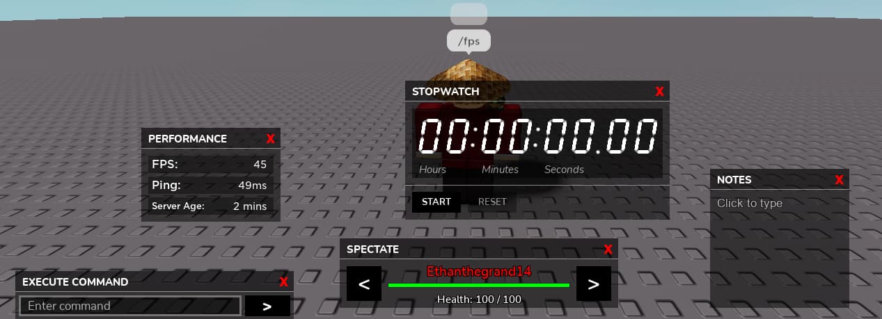
I’ve been working on a new admin system for the past month. Here’s a video of the design I made for it:

BRO IM LITEraLLY IN TEARS WHY DOES IT LOOK S OGOOD???
how are u getting GRADIENT GLOWS over ur icons…
Thank you very much! I’m pretty sure I snagged the image glow texture from a community resource, though I forget… Here the id: 8774493213. Use a 9 slice to the shadow to slice the way you want it so it doesn’t stretch if you know what I mean.
Sweet!
I like the extra touch you added to the list alignment being to the left in the first image for the available flights list. Gives off a good feeling. I think having that frame cover the whole x axis might look a little better though, not the biggest thing. It lessens the darkness on the screen and that’s good.
The second image is amazing. I just recommend a tiny bit more y space between the “search flights” button and the “choose seat” title.
Also, I like the connectivity with the device itself with the share and download button on the third image. Nice job!!
It’s an scrolling frame so covering the whole x axis will not give off the effect of being scrollable
Anything to indicate it is clickable would be great for accessability, users on mobile, or using the accessible ui mode wouldnt be able to hover over it and see that it is a button.