
Not aligned, don’t use italic font on notification’s description.

So empty. Yikes.
Not aligned, don’t use italic font on notification’s description.
So empty. Yikes.
Ah yeah, true. Thanks for some feedback though, I’ll work on that! ![]()
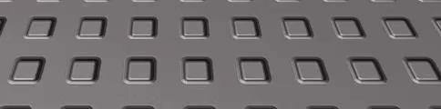
I have made a subtitle ui for my game.

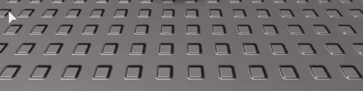
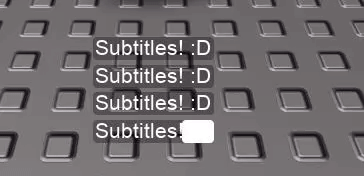
and they’re stackable:

for better quality click here! And here!
@VenomR10
That looks epic dude, especiallty the transitions, the only thing I can suggest is a hover effect for the main colour of the box change it to be a little lighter than it was, without the small colour change it doesn’t “feel” responsive, well in my opinion.
Other than that small thing this is very good.
@M_xpDev
Quick suggestions and notes,
Screenshot 1:
The admin button is a bit too far to the bottom left, I’d suggest moving it up a little bit and alligning it with the center box (The inner-box that is darker than the shell.)
Screenshot 2:
The only thing I have to say about this one is with the underline below “GAMEPASS NAME” it could be centered between the text and the title, it’d look better.
Screenshot 3: The “Username” and “Reason” text is too far to the left, it’s also at the bottom of the box, the colour scheme is also pretty bad for the GUI, it stands out too much.
Overall: It looks like you’re starting to make progress in UI Design, keep up the good work, don’t let my feedback discorouge you, it’s only supposed to help you learn.
@frederikhome
That looks pretty cool, the transition could get annoying in a real-game though, the idea and the execution is good ,that’s all I have to say, does the box automatically scale to the text that’s put in it, if it does it can be used for RPG style games.
Style: Simple - Modern theme
Programme used to create your UI: Animate CC / Studio
Not Roblox, but a little app I’m making for my bf for Sims 4. Would probably use this sort of style in Roblox for certain things:
Style: Simplistic, Flat, Modern
Programmes used: VS Code, Bootstrap Studio, CreativeTim, React (Roblox alternative is Roact), Electron
How’d you use Animate CC to make that?
Animate CC is originally for creating 2D Animation; traditional or motion design.
The behavior & tools to create assets is very similar to Illustrator CC, assist solely on Vector creations, so it’s pretty much the same way you’d make a logo with anything else i suppose.
The plus over illustrator is that you can easily make a sequence out of your vector work via the Timeline, with x Frames, you can convert all the frames to x FPS into a spritesheet you can eventually import as a image and play it on Roblox
the animation was made to be compatible for ~20 FPS, obviously, increasing it is accelerating the GIF, and not making it smoother as TweenPosition do
As long your vector doesn’t contains much sources that have alot of pixels & colors variety (such as Photography), it will run without issue and the app will be able to optimize the whole pack easily (the Trophy one = 119kb)
i’ve been considering doing a tutorial about making your own gif in roblox but i’m not sure of it.
That honestly clears a lot of stuff up as I didn’t realise that you can use Animate CC to produce spritesheets that you can use. I think you should make a more elaborate tutorial on this, thanks for clearing it up though!
I myself know how to do it however a tutorial would be good so I could pass it on to other users when they request help, good luck if you do make it!
The box automatically scales with the input.
Remade the Minecraft Main menu
Style: RPG Menu?
Program used: Adobe XD, Photoshop, Roblox Studio
Pictures:

Game Link: the craft gui - Roblox
Style: Minimal
Program used to create: Adobe Xd, Blender
Used for one of the projects I’m thinking of making so I threw this together in half an hour or so.
Picture: 
@syntax_moe
Niceeee, the GUI overall looks pretty good however I see one or two issues.
You can see the spawn point and you can see the user who you can see underneith the GUI buttons.
@DaltonBauer
For the first GUI I think it would be better if it all fit in the blue inner-box it would look much cleaner that way.
@ValesLimit
Woah, that looks pretty cool dude, if I were you I’d disable the chat, leaderboard and backpack GUIs
I quickly made this script you can insert into the Starter GUI category.
@BuildIntoGames
The dot seems a little out of place on the first screenshot
And in the third one the description text is out of the box, I know this is intentional but I feel it would be better if it was in the box, it doesn’t fit the theme but it’s worth a shot at making it look a little better.
Other than that it looks epic.
What do you mean with blue inner-box? I don’t really understand what you mean with that, could you explain it?


