Just finished this! Feedback is appreciated!

The indicator is useless, you can just do something like bold-ing the textlabel.
That looks epic! Are you going to make a tutorial at some point?
Maybe, it’s just tweening and rippling.
I was messing around w/ new UI gradient and found a nice way to get away from this issue:
This also makes things like a heartshaped health display possible or even a proper recharge for a powerup animation in a circular (or any) shape
There is a other way to do that without the UI gradient you just need you a frame with clip descants and have one behind and the other on below it
Clips descendants doesn’t work with rounded objects though so that would not work in this case
You could just set the ImageRectSize property.
You can use ImageRectSize for any shape too.
It’s also not recommended that you update a gradient’s Color or Transparency sequences often as it incurs more performance drag than necessary for such tasks. There are a lot of ways to get around the old issue including clipping descendants for non-rotate UI elements, using image rectangles, or even using the gradient’s offset to move it around instead of editing the Transparency NumberSequence.
Using gradients is an interesting way to solve the problem though, and I’m sure there are a few fun things you could do.

A code input, if you tab it goes to the next one when you delete it goes to the previous one etc.
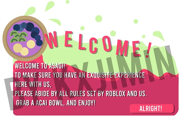
Just a heads up, do not import images with text into ROBLOX! The quality is bad, like really bad.
I am in the process of developing the menu for a game called “The Paradigm.”
Each button in the menu contains 4 objects, with the first being the button, the second being a frame for the button background, the third being for text, and fourth for the text’s shadow. By having the background and the button be separate, it would prevent button glitching when you tween the size of the button to be larger or smaller:
Currently revamping my own custom leaderboard UI, here’s the result so far:

Apart from that, I am also designing a settings UI for Frizzed, a cafe group.

Ah. It’s a placeholder text so its fine.


