It’s really clean. You could remove that fade-out effect though, it doesn’t really fit in (or stretch it a little bit.)
1 Like
Yeah, on the updated version is this updated, but ive stopped continued working on it but it still looks really cool!
Although I am not specialised in UI designing- I do some prototype designing. I agree with most of the statements by @0ffxInventor.
Indeed, whilst the project’s popularity may not matter, the quality of the project’s design would definitely be highly relevant to the UX. This may not exactly be a triple-A UI as you can only pick single guns from it without customisation and advanced systems such as tech trees, which means the UI is more decoratively high quality than generally at a triple-A standard.
Although I do not know much about colour rules, it is evident that the engagement and attractivity of this UI are not enough for the general public. With only blue, white and black as the primary component colours, it does not provide a futuristic vibe or a realistic military atmosphere. In reality, it’s just dark and under-decorated.
Indeed, the top-row buttons are too much to the left, misplaced under the logo, while there is not enough on the left. The infantry classification buttons are also somewhat confusing, placed after the weaponry selection. Thus we do not know whether it is a part of the weapon’s customisation or the actual gun type selection. There is some unnecessary space in the middle of the gun selection and the individual display box; it is pretty evident that it is much darker than the background colour and creates an unsmooth feeling.
Of course, @InsanityFE4R UI is certainly appreciatable and shows many skills, but again, it is not very kind to criticize others with notions that one does not even have.
2 Likes

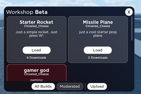
A Admin panel im working on. called Fusion X
9 Likes
this ui i made looks kinda bad since it was made in like 5 minutes i will be changing it in the future
3 Likes
also thank you for this sir ^^
Try making the background of the buttons on the left 255,255,255 with .85 transparency. Don’t edit the borders. I want to see what that looks like.
May i ask what font you used?
Gotham SSC.

7 Likes

inter is a w ![]()
1 Like
Better than Roboto, at least lol.
Roboto is actually pretty pog but it looks like crappy in Roblox for some resson
There are some design changes that Roboto would benefit from, however it is a huge improvement from the old Roboto. Inter was meant to be those design changes, however Roboto still has its uses.
If only ROBLOX supported spacing customization, it wouldn’t look as bad.
1 Like
3 Likes
Bread trees, do you have pasta with green pesto and tuna trees?
The GUI is very good, great job!
4 Likes
Using it in my game as a main menu and Mobile Phone, because the Mobile Phone irl has Roboto.
looking for feedback on this are you sure frame
the rest of the GUI in my game is pretty good, but i don’t really like this one in particular

2 Likes
it looks good, just make the corner radius a bit smaller and you’re good to go (maybe make buttons smaller too)