for sure! no need to give any credit tbh
1 Like
Wow, this is really good already.
1 Like
Personally, Maybe some 0.27 thickness uistrokes would clean it up but other than that its a solid 9.6/10
CARS VS TRAINS
7.0.0 UPDATE
Featuring,
New Intro.
New Loading Screens,
Indevelopment Server Browser (Hence The Lua Table spamming in output as its the serverbrowser updating.)
3 Likes
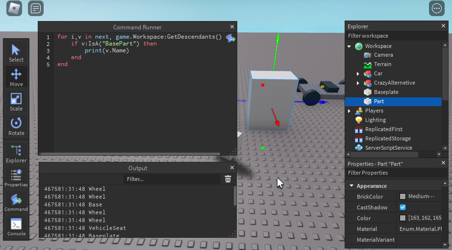
Noxirty could you please tell me how to do this or give me the script
No way people are butthurt over someone showing off their UI.
1 Like
We’re annoyed that people like to get egotistical and show off their mediocre stuff.
6 Likes
damn thanks man, i didnt know that people would actually like this lol
2 Likes
It’s simple and still looks really neat
1 Like
it already is
2 Likes
i love it!
maybe make the settings button orange
1 Like
Would use darker colors for the buttons, maybe set the TopBar BG Transparent or less rounded.
Also make smaller the icons on the topbar, join them a little and change some of the icons.
Review: 7/10
Small details make big changes.
1 Like
A few issues:
It’s very unclear what page you’re currently on. To fix this, I’d get rid of the gray background on the pages you aren’t currently on, to give an active indicator. Plus, it seems like you are using multiple unneccesary pages on the navigation rail which doesn’t require the quick accessibility the navigation rail provides, and gives a cluttered, messy look to the navigation rail. Instead, place these items such as settings in the top, or in a drop-down menu.
Although the corners on the navigation UI look nice, it just feels weird. Perhaps you should switch to something that looks more like this?:

Also, I’d remove the @USERNAME on the top, as it creates
unnecessary cluter since you already have it on the navigation rail.
Finally, the content feels very smushed together, making it overwhelming and confusing for a player trying to join a game. Think about your priorities… are tags more important than the play button? There’s a reason why ROBLOX only shows more content on-scroll, and has a huge play button right there.
Otherwise, everything looks really nice and its mainly just layout issues, the actual look of the UI is amazing.
1 Like


That’s what i’m currently doing!
Have in mind that this is not the finished product, the Money ![]() category does not have a actual tab for them and there’s a high probability that some icons will be changed.
category does not have a actual tab for them and there’s a high probability that some icons will be changed.
Style: Modern and a little cartoony, I suppose?
Software: Only Roblox Studio and some icons from https://www.flicon.io/
Pics:


Also, the UI of the Skins category is a total rework of this UI:

Is it better? or worse.
Any feedback is welcome c:
12 Likes
I’ve already posted this here:
But why not post it here too lol
I’m making ingame debugging tool for developers to use!
Heres what the toolbar looks like so far:

(The UI is heavily inspired by stravant’s quick road plugin)
3 Likes
How do you make the console accessible in-game?
Might create a system that automatically gives you the tools when you join your game, or the command bar via the developer console (Will most likely create a system)
1 Like

I’ve put everything together, and here’s what it looks like so far!
All I need now is to optimize some code and it’ll be ready ![]()
8 Likes