it’s been 2 years why now bruh
It’s just your previous UI but red and the guns are replaced with cars.
5 Likes
Hello! This was my first figma ui, It is a Host Panel. I would use it in roblox studio but sadly It is a very hard process to import UI from figma to roblox.

Program used: Figma
2 Likes
Im interested in this type of design.
1 Like
This is too cluttered imo. Too much like the mobile UI (which is optimized for touch UI, not mouse + keyboard.) The text is also too big, it can be shrinked a bit. The tags section should 100% be shrinked or move to a scroll, and the “no tags for this game” text should be made smaller and centered.
Play button is also a bit too small, it’s the main action of the entire page. Also, the Robux icon should probably be the flat one in this example, not gold.
Dont take my feedback too harsh, it’s just my thoughts.
1 Like
I think they just are uncomfortable with making scrolling views on Figma, they didn’t purposefully want to make it cluttered.
1 Like
But all of this is made in powerpoint, microsoft’s presentation software
1 Like
then u should make multiple slides. there’s no point in cluttering the ui this bad
1 Like
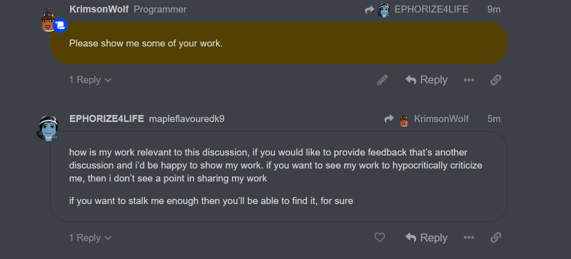
Hello, your gui looks very nice.
Here is some advice

- This REDEEM button is poor contrast.
The background is dark which means it calls for a light button (which you did) however you used white text. White text is bright on bright which makes it hard to see and overall takes away from the quality of your design. - The green you chose is uncalled for and inconsistent. If you want to keep your GUI consistent you could consider a red instead or a shade of blue.

This “Enter code here” has 2 issues.
- Its the same color as the background. This can make it stand out less and instead the attention is towards the X button.
- It looks like a button which may be unclear on its immediate purpose.
Edit : I appologize for the troll reply. Please understand that the person who is attempting to invalidate my response is only doing so because of ignorance or to be arguementative. I have done GUI design for 3 years and I just wanted to give you some advice. They do not work with GUI and have no actual creations.
Lets ask some AI shall we!
it’s poor contrast however buttons are never that light
also, green could mean “success”, with cartoony uis more color is wanted 99% of the time
it’s a surface variant, it works for it’s purpose
because it wants action similar to a button
i’m not dismissing them as everyone has their own taste; also feedback doesn’t concern anyone including you according to that logic.
- with feedback, different perspectives are important so the UI style doesn’t become significantly biased, by you saying i’m dismissing your suggestions by providing my own suggestions to keep it worsens the feedback given
2. Your suggestions are trash
The icon you have that moves should stop moving at the same time the text stops moving. Also it moves back in fourth. I suggest you use the linear tween type (not bounce you have or something).
Your workshop beta text is either too close to the edge for comfort or the UIcorner is too intense.
The yes and no buttons are too far apart.

Way better! Just make sure the contrast is good enough on the left.
pretty good!

the buttons look a little weird, i would recommend moving them or smth idk
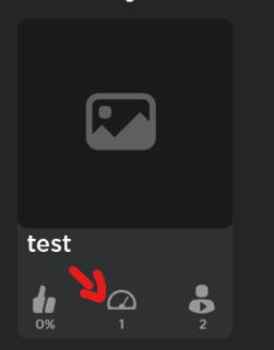
this would confuse me, since i do not know what it does or means.
That icon means how many visits that game has received
The Roblox button has been changed to a home icon, and Discover, Avatar Shop & Create have been condensed into icons.

For this one however,it works the same but for ugcs. you paste the id here and you and the creator gets robux as well. IF you want to try it out, there group is here Y2$hiy - Roblox. go in experiences and go in in-game-buyer ^^
6 Likes