I dumped it myself using a qt extract script that i have
I’m sorry, you still haven’t awnsered my question if i was allowed to use your iteration of silk+ for future updates
Yes, you are allowed to use my iteration for future updates.
doesnt work. same with other texture packs HELP MEEE
Select the folder that has the folder “RobloxCustom” inside of it when you extract it. then in Roblox Studio select that folder for custom icons in Studio Settings.
i fixed issue already, anyways thx for help!
The reason this icon pack was so needed for me was because the new studio icons ruined my workflow to the point where I was getting lost on pretty much everything I did. This is such a refresher. Thanks for the amazing pack!
This is awesome. Thanks for making this, it makes everything alot more readable now.
thanks! I’ve been wanting the old icons for ages now!
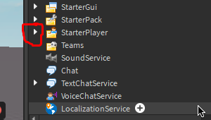
Such a cool icon pack! and i have a question, how i change this icon to the old one?

this is unfortunately not possible as far as i know
This link isn’t working. Here’s new one: Category:Silk icons - Wikimedia Commons
Also, nice mod! Like old icons
hello. i found the old icons of the script editor and you could add them to your icon pack, here’s the Post
i’ll take a look at this later!
Hello! if this helps, the name for the texture generator in the ribbon is “MeshTextureTool”, I also saw that the audio review icon is still the same, if you need it, the name for it is “ViewSounds”.
All the original icons with their respective names are in the “content/studio_svg_textures” folder.
Also, thank you very much for creating this icon pack! I really liked those icons better than the current ones.
tysm, i was like spending hours trying to find it in the “studio_svg_textures” folder myself
edit: im gonna publish a update to this later today, i wish roblox was a little bit more consistent with icon names lol
That’s fine! I’ll wait the update!
Unfortunately I believe this is an issue from Roblox’s end. This isn’t anything new this was reported a while back from a bug report and staff responded to it but never followed up so this is technically almost 2 year old bug.
Is there a reason my model icon looks like this after installing?
![]()
I’m on macOS if it matters
