Hi developers!
Today, I am going to show you the simplest way to make your GUI fit to all devices using this awesome plugin. Why we have to do this ? Well, i have seen people having problems with their GUI not scaled properly, it makes us feel quite uncomfortable. If something is wrong or having any suggestions, you can let me know down below. Anyways, let’s start.
STEP 1
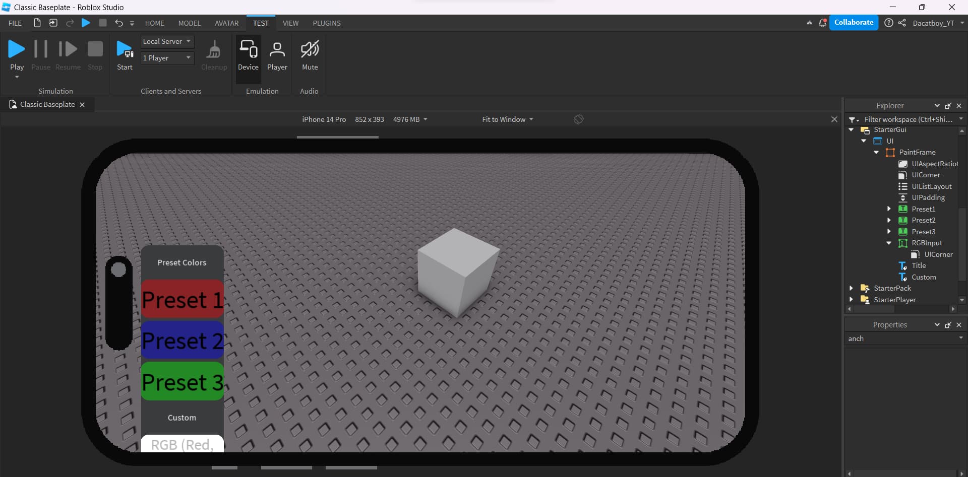
Create a screen gui and a frame (or textlabel, textbutton,imagelabel,…) inside it, go to the properties and set the AnchorPoint to 0.5,0.5(after adjusting, it will be moved a little bit, you can drag it back to its original position)
STEP 2
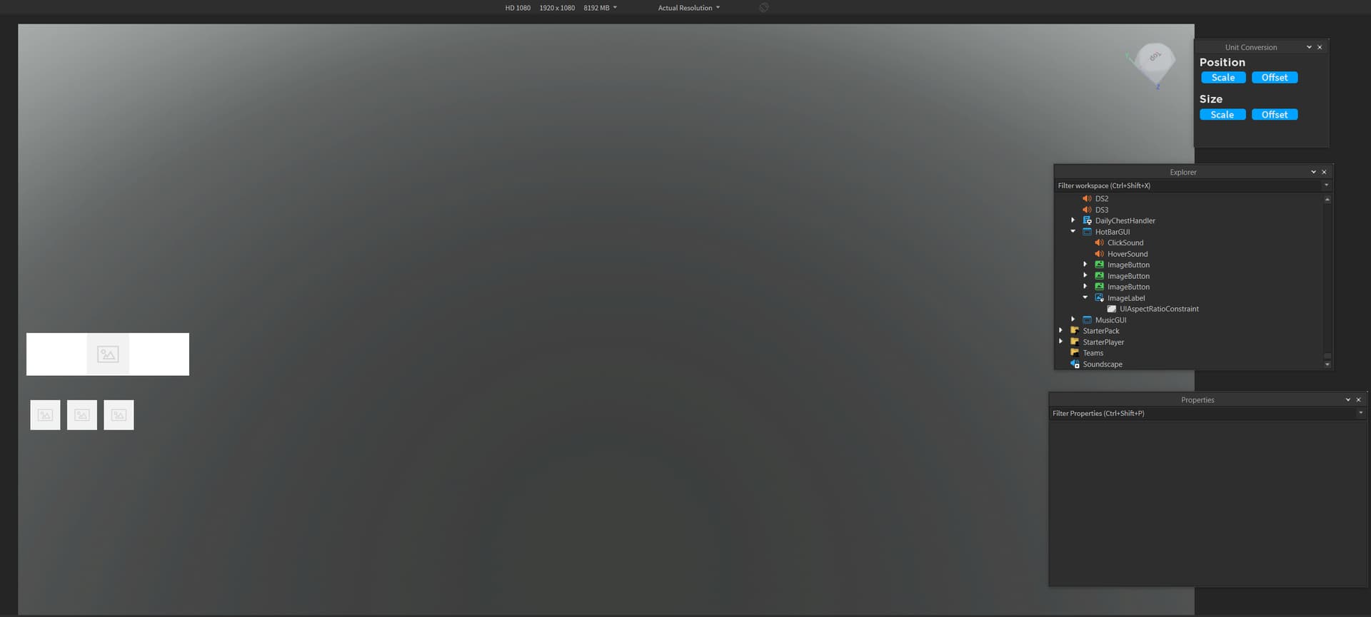
Open your plugin, we will need to use these buttons , click the blue one, select the UI which you want to scale then click Scale(both Position and Size)
STEP 3 [OPTIONAL]
Why is it optional ? Because done step 2, your gui has been rescaled properly. In this final step, we will add UIAspectRatioConstraint to keep the aspect ratio of the gui unaltered on any devices ( use the red button of the plugin )
For example, the ratio of the frame is 2:1, it will be changed on other devices if we don’t use UIAspectRatioConstraint ( i will use iPhone 4S in this case, as you can see, it changed from 300 x 150 to 131 x 90 [ not 2:1 anymore ] )
Hello, this post seems very helpful but for some reason it does not really work for me that way.
I did everything you said, but the buttons that you will see in the screenshot are still taking more distance from the top element than they should. I am working on a very huge screen, but I just can’t imagine that this is a problem. Is there a way to fix that?
I use the UIAspectRatio in combination with the blue button settings.
First of all I press both blue buttons (for scale), and press the red button afterwards for the UIAspectRatio.
Is there anything I do wrong?
Right now I use a manual created UIAspectRatio with a value of 2,
(even tho I don’t really know what the value has to do with all this, since I am not a GUI - designer) but it’s still kinda hard to add an element with a perfect position / size.
When I press both blue buttons (scale), and after that the red button, then the positions for some elements are diffrent in other resolutions.
The GUI itself is constantly in the StarterGui, I do not change the parent of it.
as you can see on my screenshot the elements are still not in the correct position. (on some resolutions)
I am really desperate about the situtation, since I really need my GUI to work.
That’s because the positions are relative to the screen size meaning the gap is also relative. To fix this, make the buttons the same position as the top frame then you should have something like {…, …}, {…, x} make sure to set the x to 15
I don’t really understand what you mean, if I set the position of my bottom buttons to the position of the top element then the buttons are inside of the top element.
Another thing is, I thought you should never use the offset value {scale, offset} for editing GUIS.
Could you maybe explain me what you mean, by some screenshots or more information?
Because I don’t know how this is gonna fix my problem, if I just set the position of my buttons to the top elements position.
The only thing I try is to bring the buttons below the top element in the correct position, wich they aren’t right now.
In order to achieve this, I am trying to use the plugin but for some reason they are not positioning correctly as they should. As @Chinesse_apes said, it has something to do with the relative position.
Sadly I still do not exactly know what he means by that.
The Position property has 2 values: X and Y
And they both have a Scale and an Offset.
X Scale is relative to the Screen Width
Y Scale is relative to the Screen Height
If you set the Y Scale to 0.333 then the gap from the top would be 1/3 of the Screen Height (simplified without accounting anchorpoints etc). As you can see it’s like % except it’s between 0 and 1 like normal fractions
(
eg: you have frame with y scale 0.333 and your computer screen is 1920x1080. So 1080 / 3 = 360 so the frame has a 360 pixels gap from the top.
Now if you switch to a bigger computer (3840x2160)
2160/3 = 720 so the frame has a 780 pixels gap from the top.
).
Scale depends on the screen size.
While Offset is used to offset things like its name suggest.
Using both Scale and Offset is a great practice.
Offset is not relative to anything, you to set the offset in pixels and it offsets.
(
eg: You have 1920x1080 computer, the frame has a 30 px gap,
It’s therefore 30 pixels from the top,
You have 3840x2160 computer, the frame has a 30 px gap,
It’s therefore 30 pixels from the top,
)
I also used to believe that, but now it feels like what a 1-2 month experience developer would spread.
Offset is primordial for roblox games, i believe that developer that use only Scale and discourages offset are too lazy to make a good ui for both mobile and pc. They often think Scaling it down is completely enough.
instead of doing all those steps and downloading that BOOM plugin I just leave the scaling at zero and then I adjust it automatically IT’S READY for phone and pc and I think xbox, in case xbox doesn’t, well the one that’s going to make a game from xbox, well, you know that this plugin is not useful either, but well, what better than that for stupid people?

, click the blue one, select the UI which you want to scale then click Scale (both Position and Size)
 , click the blue one, select the UI which you want to scale then click Scale (both Position and Size)