
1 Like
I feel that warnings should be a more irritable colour like red, and perhaps make the background a bit brighter since the target audience is relatively young and attracted by bright colours
2 Likes
the lighter colors is definitely better, but for the more irritable colour, I just don’t see that as being as good for the design style. I do understand why that would be a good idea but for the style I don’t know if it would work.
1 Like
Pretty nice work with the UIs, yang! If I were you, I would make the background color something more neutral, such as white or light blue. That way, you can setup both buttons (yes/no) in a way where they contrast each other w/ a clear meaning just based off the coloring
A good example of this is in PS99:

Using a white background in this case allows them to create a clear distinction between Yes & No, which is very important. In your first UI, however, using a green background makes it too similar to the green Yes button
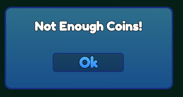
For your second one, I would make the background a bit lighter blue and then brighten up the button a bit: higher saturation, lighter stroke, and then move it down a bit
Overall, your UI work is good either way! My suggestions are simply observations from another pair of eyes & completely up to you if you’d like to incorporate them ![]()
3 Likes
I’ve ligtened up both of them a little bit and made the yes button a lot more noticable. Thanks for the feedback!
This GUI looks great! Nice job on it!