right makes sense thats epic ill have fun with it
Consistency in the top-bar seems to be a big issue with this update, for example, the model tab uses almost entirely white icons, except for the few randomly colored icons. Likely due to the fact that they are instances. Also, as a side note, the collision editor has no new icon.
![]()
The test tab also has this annoying color:

Also, the ‘play’ icons need a better way to distinguish between them, if I was a new developer I would assume the first play button in this image plays my game, the second one plays my game and saves it too and the last one plays my game and records the footage. As you can see, the last 2 are entirely different to their actual purpose.
![]()
It’s not in the beta feature tab for me
its titled “Enable DPI Aware Studio”
I really like this update! The one thing i want to change is for consistency, make the server script green 
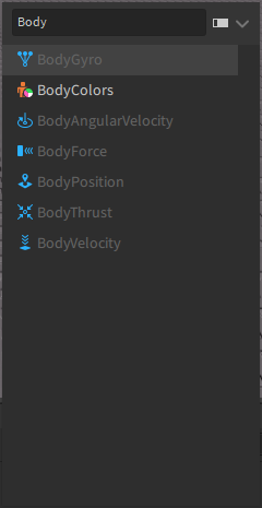
By default, the Insert Object window hides deprecated instances (such as Body Movers). To access them, toggle the setting “Deprecated Objects Shown” under Studio Settings.
Additionally, you can also use CTRL+I to open up the Insert Object window with ease.
![]()

![]()
ReplicatedStorage look so… weird
Roblox should implement a studio setting that lets you change the icon design.
Some users may benefit from having single coloured icons, instead of the vibrant ones that there are currently.
I understand we now have the option to upload our own custom icons, however I think its necessary to have a few default options avaliable to newer roblox developers (Much like the current studio theme option).
Such as:
- Default
- Light
- Dark
Really love this change though!
Thanks roblox 
This completely ruins my coding font. With the beta feature on it makes it practically unreadable.
Previous Code Editor

I really like the new icons but this new “bug” or something, I don’t know really ruins this beta feature.
i like this but its gonna take a while to get used to
The new High DPI really screws up the rotation of the camera in the studio workspace.
It causes stuttering, and oftentimes the camera will not go in the direction in which you’re moving your mouse.
This is me simply moving my camera up and down.
This is a trash update, why do you people always change stuff in Roblox Studio without consulting us developers?
Overall I love the new designs, They’re sleek and modern, easier on the eyes!
There are a few gripes I have that I’d like to point out and hope they are edited/fixed!
For starters, yes, the icons in the top ribbon are very monochromatic and are kind of depressing.
I 100% agree with this, the current workspace icon is just very busy and doesn’t really convey what I assume to be a globe.
The workspace icon should either be redone or rethought entirely, maybe a 3D plane icon would make more sense?
Edit: New different workspace icon
![]()
Along with changes to the workspace, there are a few things I would change with Parts and MeshParts
Flipping the Meshparts Lines to be on the inside should make it less busy and more readable in Light Mode, along with this the Part icon’s lines could be thickened in some areas to also be more readable in Light Mode.

Personally, I’ve never felt that the Replicated First icon ever communicated what its used for properly, this is a icon that could maybe use more thought, I have no proposals on what could replace it.
There are a few changes I would make to the current icon if it stays;
As mentioned in the quoted post, making the Replicated First icon match the Replicated Storage icon’s orange would bring them together.
Alternatively, making the icon match the local script, and local outputs blue would also work.

And finally some changes to the script icons
Making the Script icon match the output of the server just seems like a no-brainer to me.
For the Local & Module scripts, I feel as if the monitor and jigsaw could be expanded by 1px

I am NOT a graphic designer in any capacity, these are my thoughts on the UI using a 1080p screen
Above all else I’m in LOVE with these new icons <3
WRT the script icon being green, I saw some feedback another user had about this where the white script blends in too thoroughly alongside parts inside of models and etc. which is not ideal. Coloring it might actually be a better move even if with runcontext it’s unclear. This icon should change dynamically based on that property anyway, better to do that sooner with the new icons rather than later.
I appreciate that this is an opt-in feature that isn’t forced upon developers; I still majorly dislike the new UI and icons.
pretty cool update
can you guys make more script editor themes?
it will be very cool
A comparison between the new explorer icons and my components plugin. As of right now, the API for getting studio icons needs to be updated to keep the consistency within studio. This needs to be considered before a full release of the design refresh icons.
StudioService:GetClassIcon("LocalScript")
Yeah, I hope they add texture pack options for doing old, new, or your own texture packs.
I had an idea to make them all similar (to easily tell that they are scripts) but still being different from each other. I made these icons to test it out and it works pretty well.
This uses a similar blue tint that the original script icon used.


Hoping someone makes a custom icon pack with the old icons before this leaves beta. I really don’t feel like learning an entire new set of (not very good) icons for no real reason.

