Nice, but please add an ability to switch between old and new, since I prefer old ones.
3 Likes
It looks like I didn’t even get the new icons! I’m extremely confused right now, all that this update did is break my mouse and introduce even more high DPI scaling issues.
1 Like
The other thing about this is I swear that it was the other way around before where blue is the server and green is the client. But I agree that if there are going to be color categories, everything should be consistent with them.
1 Like
are they rolling this out or just giving it to everyone since i dont have it yet the only updates i get are the beta features that you can enable but i havent gotten both this ui update or the old one anyone know why?
1 Like
I didn’t even realize, they were def the other way around
You could enable it easily by going to File → Beta features and you will find it there.
1 Like
There was small period of time yesterday (12-2PST) where some icons were missing. This has been repaired, and can be resolved by reinstalling Studio or turning the beta feature off.
2 Likes
the new ui isnt a beta feature its just an update for everyone so i cant enable it
I hate to say that I think these new icons with this hefty minimalism design looks absolutely atrocious. It’s either a mess of colors or only 1 flat color all across.
Is there not a way to opt out and continue using the old icons?
EDIT: I found out it can be temporarily disabled in beta features, thank God.
4 Likes
Why do the icons look horrible for me. (Jagged or blurry)
I use 1440p with scaling set to 115%, there were no visual bugs with the old UI using same settings.

I can see this change only being made to make Roblox Studio look more inline with other game engines. So that investors would be happy.
The old UI was superior in every way. From no edge glitches to better color coding.
Adding to that why has this update broken studio camera controls. My mouse selection on screens seems offset from the object my mouse is hovering on. Not only that, but when holding RMB to view around my camera jitters into the other direction at random.
(visualization where my mouse is on screen and the part Roblox thinks my mouse is hovering above)

6 Likes
Hello roblox designers, I understand that new is better and old is ‘no good’ or outdated.
Thats the irony.
Please just give us an option to either keep the old icons or use the new ones.
If it aint broke dont try and fix it x
1 Like
genuinely an amazing update, when the new icons came out back a few weeks ago I liked them much more than the old ones, then they disappeared, didn’t come back until today, a genuinely amazing update!
Most Roblox icons that have lasted a long time were never designed by Roblox, similar to sounds. Roblox clearly doesn’t want this to haunt them in the future (we’ve all seen what happened to the oof sound…) so they’ve changed it. You could say it was “broke” and they did fix it. ALSO I think you’ve glossed over the fact that there’s custom icon support, you can just download the old icons and use them for custom icons!
1 Like
amazing, love it (except all the plain white icons pls fix thx)
2 Likes
It’s probably not that, atleast partially. See, Roblox actually never made some of the old icons, they got some of them from texture sites. There’s a chance that some of these images may be copyrighted which could cause a “oof-sound” type incident again, and Roblox definitely doesn’t want that.
Roblox has added a sort of work-around for that, instead of them changing the icons themselves again, they allow you to do it yourself, the custom icons feature that they removed like 2 weeks ago and added back today
1 Like
right makes sense thats epic ill have fun with it
Consistency in the top-bar seems to be a big issue with this update, for example, the model tab uses almost entirely white icons, except for the few randomly colored icons. Likely due to the fact that they are instances. Also, as a side note, the collision editor has no new icon.
![]()
The test tab also has this annoying color:
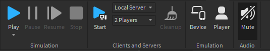
Also, the ‘play’ icons need a better way to distinguish between them, if I was a new developer I would assume the first play button in this image plays my game, the second one plays my game and saves it too and the last one plays my game and records the footage. As you can see, the last 2 are entirely different to their actual purpose.
![]()
4 Likes
It’s not in the beta feature tab for me
its titled “Enable DPI Aware Studio”
2 Likes