Hey all, I’ve decided to re-continue work on a showcase and I was wondering where I should go next with it. Here’s the link: Lush: The Beginning [Showcase] - Roblox
This triangle looking terrain exerted from the ground could be smoothed
Trees
Personally, I find it difficult to find the right trees if you’re getting mesh ones- its difficult to make them blend in with the game.
I feel like these leaves could be smaller and maybe use the grass material? Its up to you obviously, but it seems that the trees doesn’t work for me in this wonderful environment of yours.
Lighting
Lighting is so important to make a game look so beautiful and this is where you can show more flare in this showcase. The sun is not in a great position, you should try to change your GeographiclLatitude to deal with this bloom:
Or simply just turn down the bloom
Secondly, I think you could add more sunlight, try to get a sunset there with more of a orange tinted environment. You can get a contour of the rocks in the game which will make the showcase look even more beautiful (experiment with ColorShift_Bottom for the shadows).
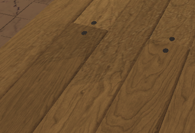
House Rooftop
You could maybe give more diversity in colours with this top row of planks, looks like you got a sly pattern going on:
Overall, this is a really good game. I’d say I’m nit-picking but someone is going to do that eventually- but I hope this critique would of helped you in one way or another.
Hmm…this is another situation where I have to decide on bullet pointing or paragraphs. Ah, screw it.
I would recommend:
Hiding the cursor as well as making footsteps soundless.
Give the grass meshes the same colour as the terrain grass.
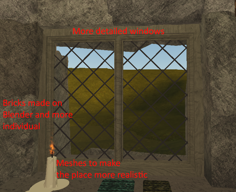
Detail the house much, much more. Bricks should really be individual, both in the door frame and elsewhere. I would make the wooden planks of the door itself have rounded edges. The windows look extremely undetailed too. I’d give the handle a more metal look, probably with the material and a darker colour.
Would use different shades for things like wooden doors. Not all wood is the same colour.


