The Beginning of my UI Career
Hello there, and thank you for reading my topic in the Help & Feedback Section.
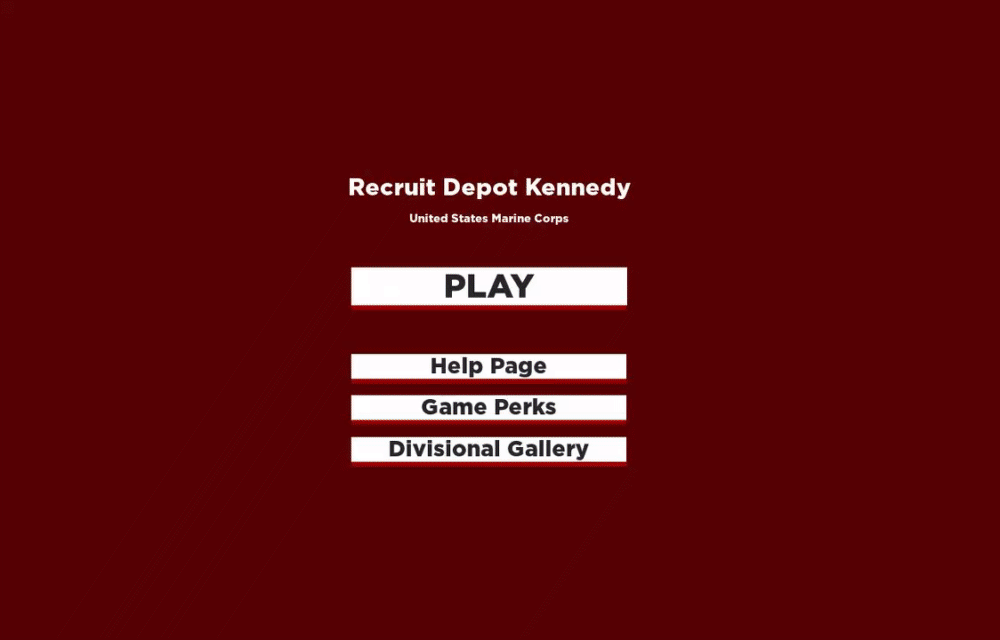
I am here to receive positive or negative feedback on my most recent work which I have completed for the use of: Recruit Depot Kennedy owned by AmericanHades
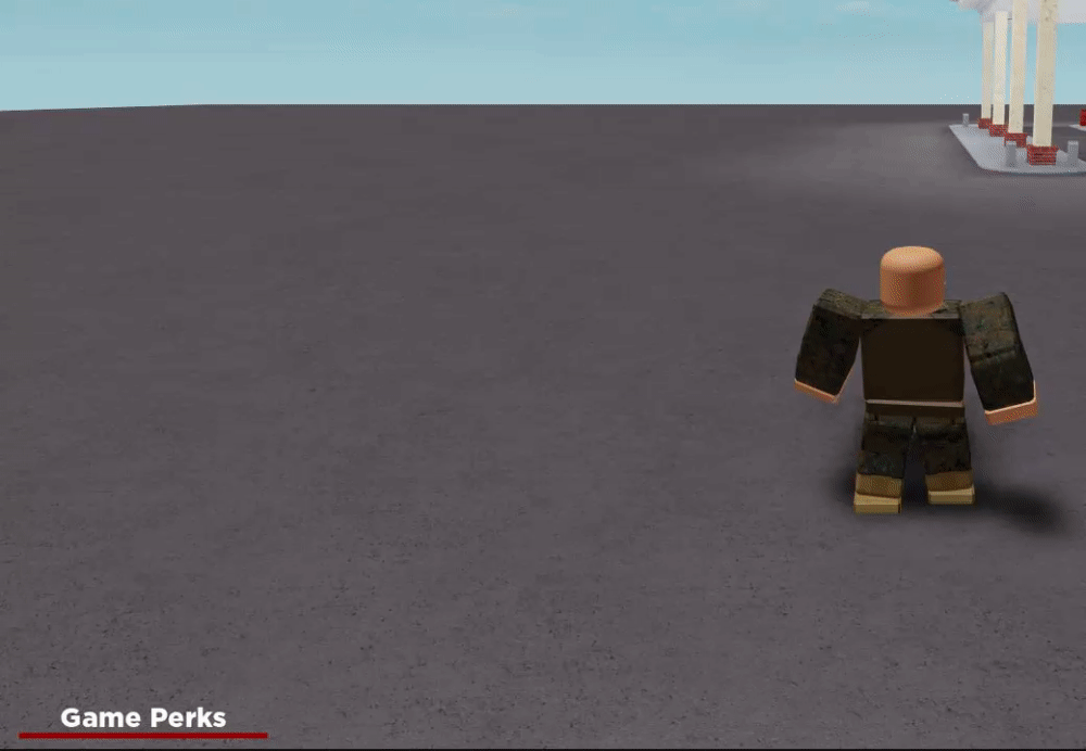
This work of mine is a Loading Screen and an in game perks store, which I have put my utmost effort into. There has been a lot of stress creating this UI as I am not the best Scripter, but I have gotten through it!
Please let me know what you think of my work, and be detailed in what you comment as it will be most appreciated. In my opinion, I should’ve been more creative on the start of the loading screen, any ideas?
Thank you so much for your feedback! I was thinking about changing the background image, but unfortunately, the image kept going wrong due to Roblox’s current settings of the properties section for Image Labels.
It would be nice to have an option to blur the Image Labels though.
Overall, the UI looks nice. I like the color scheme, and the icons for the gamepasses are all great. Just a nitpick about formatting, though:
Please embed your images. People are more likely to give feedback if they can see the images easily. Just put “i.” in front of the “gyazo.com” part of the URL and put the file extension (in this case, .gif) at the end.
Edit: Apparently it doesn’t display properly under a [details] tag, whoops.
The UI looks clean, good job! I would first suggest you add some GUI Animations to make it seem like a more fluid interface. I would also make sure you put the prices under each of the items in the “Game Store” tab. This makes it easier for the player to see all the prices at once instead of clicking on each pass individually.
The UI also doesn’t scale well on mobile devices such as a cellphone, but I don’t know if you intended for the game to be played on mobile devices.
Definitely requires some animations – such as frames sliding onto the screen from the bottom or whatnot, or a button growing larger when hovered over. It’s small things like that which give quality and pizzazz to a UI. But as it’s the “beginning” of your UI career, I see a good future ahead.
Thank you so ever much for sharing your thoughts, I’ll try to see if I can add a mobile option now, I’m unsure if the game is mobile accessible though, but I will definitely check that out.
I’ll also see to the animations part now, and see what I can do.
Thank you very much for your ideas, I do believe the same in quality!
I’ll also see to the animations part now, and see what I can do. If you’re aware of any links/tutorials I could use for the animations, please let me know. I’m going to use the link I was just given for now though.
This is something you want to beware of, seeing this UI in a big screen is fine. However, if you scale the window down, it will be much harder to see (main problem with just using scale for sizing)
The best way to solve this issue is by making the UI paged (page 1, page 2 etc).
Apart from that, you might want to use UIListLayout/UIGridLayout for the menu buttons, so you can avoid issue mentiond by @Crossota.
Both layout constraints enforce a padding rule for the children in the frame, which has the layout constraint.
Are you able to scale the window? You’ve confused me on what you’re saying with that part.
I’m also unaware of the UIListLayout/UIGridLayout, but I will check this out. Thank you for informing me about these features.


