The trading system desperately needs an overhaul! Since its inception, aside from visual changes, it has severely fallen behind, especially in UX. If Roblox plans to introduce UGC scarcity in the form of limiteds, the trading system seriously needs improved.
Here are some suggestions I think will go a very far way to help make trading easier and more accessible, removing many headaches, as well as keeping users involved in trading safer.
Trade Page: Collectible Search
Currently, navigating through user’s collectible inventory, especially to trade, absolutely sucks for any larger inventories. Fan-made sites like Rolimon’s allows for an easy way to view specific player’s inventories, and their combined RAP/Value, but the problem still exists when sending or countering a user’s trade in the send trade page.
Here’s an example. I want to send this user a trade for their Dominus Aureus, and I want to give them RV+. Finding this item alone in my inventory requires me to go through 29 pages, out of a total of 68 pages. This doesn’t even include the other items I may wish to add on.

Okay… this was worse than I was expecting it to be lol. Almost 70 pages, and I’m not even past a hoard of a singular item, which is a suggestion for later.

It’s extremely tedious to navigate a user’s collectible inventory, especially in the trade menu, just to be able to send them a trade. If I could simply search “Aureus”, this could relieve so much of the tedious work as shown above. I was struggling to find an item for several minutes in my own inventory, JJ5x5’s Top Hat, to send to someone else. The sorting is also unusual (seems to be by UAID?), making it trickier to guess where the item may be.
Multiple Copies
As you could guess from the suggestion above, multiple copies, also known as hoards, of a collectible item make it more tedious to find an item, combined with unique collectibles owned by the user.
Using Rolimon’s, I can see this user currently owns 979 copies of the 8-Bit HP Bar, and has a total number of 5,216 collectibles. Over 500 pages I may need to click through to find their Aureus. 
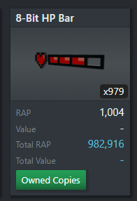
It would help tremendously if hoards of items could be combined into one card. If it’s a limited unique (limited # of serials/copies), then you could have the option to go through and select the serial you want to trade for, such as a #1 serial, which often goes for overpays.
While internally, there is a separator for regular limiteds, known as UAID, this isn’t usually important to users and is only ever used in the trading community for tracking specific copies of any limited to see which inventories they went through (such as avoiding copies which may have recently been stolen - unintentionally picking up one of these may lead to account moderation. An example being a recent dev which was comped out of 50M robux, and bought expensive items with it. Users need to avoid these ‘poisoned’ copies to stay safe while trading, especially for larger items).
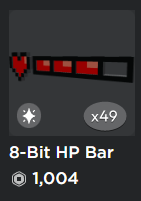
It would be great if this could be extended to our inventory pages as well, so navigating them with hoards of the same item also becomes easier, though it is not as important.
More Trade Slots
Trade slots. Trade slots. You’ve likely heard this a thousand times by now. Currently, we are limited to 4 trade slots for each side per trade. While this may have been enough years ago, large trades happen all of the time, and while it’s mostly used in good faith, the community resorts to a method known as ‘massing’. This requires sending multiple trades to a user where they give say 50K rap for a 200 RAP small. I’ve even participated in many myself, sometimes going first, sometimes not, but people get scammed all the time by this.
If we received more trade slots, possibly up to 8-16, this could greatly reduce the amount of mass-related scams that occur, ESPECIALLY when it comes to hoards of items. I may want to trade x80 of my gucci bags to someone to ‘upgrade’ for a larger RAP item. This could be easier solved if you could add 80 of them, and they only take up one trade slot. Trade slots should be for unique items, while it shows a ‘x80’ next to it to indicate 80 copies are being included. If this is a limited unique, it would be nice if it also showed which serials we are giving.
Remove Trade Messages
Trade messages give no practical information to users & traders. Users with collectibles receive many trades, and this only makes it harder to read our actual messages in our inboxes. There’s a little bubble that shows how many trades we have inbound on the sidebar, which acts as enough of a notification.
Trade Page: Updated Asset Categories
New asset categories have been released and there are no categories for them in the Trade Page, as well as inconsistent naming with these assets elsewhere.
“Faces” are now known as “Classic Faces”. There’s new layered clothing and heads which don’t appear here either. It may seem like an unusual request, but there have been two layered clothing limiteds so far, which only appear in “All Accessories”. While it isn’t as important yet, it would likely be needed at some point, at least one for general “Clothing”.
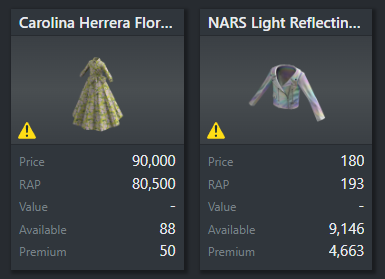
There is also an inconsistency here - it states “All Accessories”, when in reality this is just “All”. It shows Faces, Gears, and layered Clothing as well.
While there are many other suggestions I’d like to give, such as automatic Projection detection, better historical sales graphs (combined volume & RAP for each day), or trade offers as @younite suggested, I’d currently find user experience improvements more important. I will add any suggestions if I can think of some, those are just the ones off the top of my head.


 I’m trying to collect all the eggs too but I may be out of luck if Roblox doesn’t plan to make all pre-2017 eggs limited heh (they skipped over Stooge Egg & studio/website eggs for 2013
  would love to get the eggcellent scripter egg).