If you’re using precise Scale values like 0.449, random Offset values, or using an automatic scale plugin, this post is for you. (Please stop using those plugins, by the way.) As a rule of thumb, if your AnchorPoint or Scale isn’t 0, 0.5 or 1, you’re probably doing it wrong.
(I wrote this as an explanation to a question somewhere else on the DevForum, but I thought it was useful enough to post here too.)
In Roblox, UI elements like frames are positioned from the top left.
You’re probably familiar with a UDim2. There are two components to a UDim2:
-
Offset
An amount in pixels. -
Scale
Represents a certain proportion of the size of the element’s parent. For example, an X scale of 0.5 means 50% of the element’s parent’s size in the X direction.
Here’s an example. Blue is the scale, and purple is the offset. The blue part of the position changes with the size of the box’s parent, but the purple part stays the same.
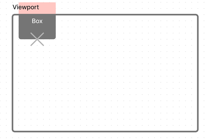
Now, remember when I said that UI elements are positioned from the top left? I lied. UI elements are positioned based on their AnchorPoint. So, for example, here’s the same box from earlier with an AnchorPoint of 1, 1:
The position of the cross (the box’s Position property) has not changed, but the box is now outside of the viewport. This is because the element’s anchor point is now in the bottom right.
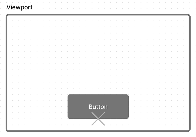
The anchor point can be anywhere within the box. An AnchorPoint of 0.5, 0.5 would make the cross be at the center of the box. An AnchorPoint of 0.5, 1 would put the cross at the bottom and in the center:
Again, the cross doesn’t move. It’s just that the box’s position relative to the cross (again, the box’s Position property) does.
Using this information, let’s try position a button onto the center bottom of the screen with a bit of padding. We’ll have to use both AnchorPoint and Position for this one.
We know we want the button at the center bottom, so our scale becomes 0.5, 1. We also know that we want it to be offset from the bottom edge a little bit. We’ll give ourselves 16 pixels of padding, so our offset becomes 0, -16 (it’s negative because we want the button to move upwards).
This is where our button is now. To add the finishing touch, we’ll need to change the AnchorPoint. We want it anchored to the center bottom, so our AnchorPoint also becomes 0.5, 1. Finally, our button is in the right place:
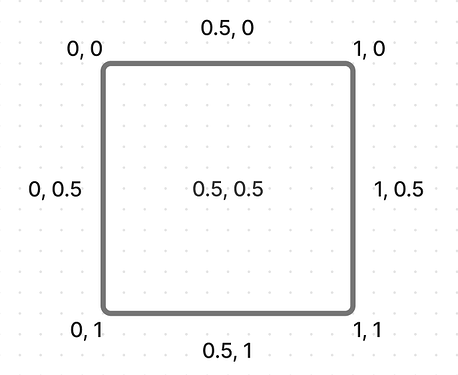
As a parting gift, here are a few common AnchorPoint values for you to use:


