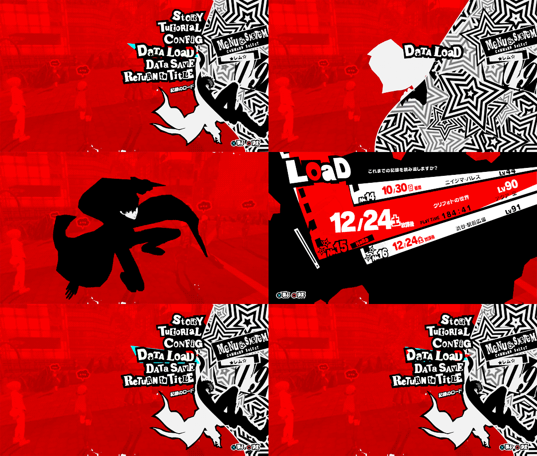
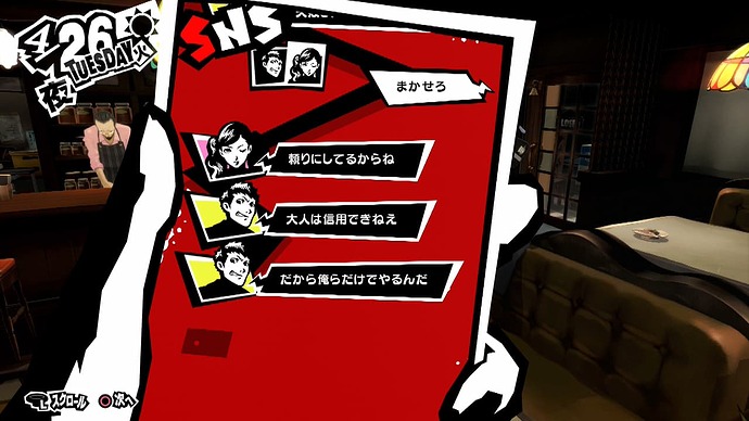
Ooh what’s the persona series?
It’s a fairly popular game franchise.
I personally haven’t played the games, just seen the menus, here are some examples of UI I found online:

Woah, it looks cool!
But sadly I’m unaware of how to make good UI like that
Do you know of good free software/website that can help me create good UI though?
Someone said Figma was good but is there anything else I should know about?
Bendy text honestly can be a good addition as long as it’s used a bit more conservatively while also being properly animated. Doesn’t look bad however the overly bendy (and likely static) buttons look pretty off and goofy. How would you animate bendy text specifically isnt something very easy or efficient to do. Perhaps one alternative would be starting to rotate each button whenever the mouse hovers over one of them by a few degrees in both positive and negative directions. This may not be the most accurate solution to what the initial vision may have been however it could be a viable alternative nontheless.
I have 3 tips for you. First one make, the UI get bigger when hover over it next step. Make the UI move for attention Third Make the colors Bright and shiny, but not too much.
Hi y’all, I took away some feedback from all of you and I came up with this •∆•
Any feedback will be greatly appreciated!
The white bar will glide down based on what you’re hovering against, and will fully go down out of view when you’re hovering over the buttons in which the boxes would have a white background and the icons would turn black
I plan to use figma to give a proper example but I wanted to show my work so far:
Cover Art is being drawn, don’t worry
Disclaimer: Everything here is subject to change based on feedback and personal preference/ideals
I had no idea that Roblox experience’s can have recaptcha text!

Jokes aside, it looks pretty good! Definitely stands out in a good way!
I like this a lot! Just a couple things I would like to note.
- I’m pretty sure you know this already but, I would move the black section a bit more as to not cause the Options button to stick out over the edge.
- I would move the square buttons down a little more, or move them to left a little more. Essentially making padding equal out.
Something interesting you could do is, make the text invert colors as the white bar moves over it. Essentially when the white bar moves over the text, the text would be black, and then go back to normal once moved off of.
Back to the three buttons at the bottom right, I suggest making the icons better represent what they entail. Of course I know that first icon is achievements, that one is fine. The other two are what confuse me, a files icon and a web icon? Deductive reasoning tells me that the web icon is either like share, or the leaderboards. From first glance I have no clue what the files button does.
I’m not saying the icons are bad, they’re actually very nice, it’s just I think they could do a better job of expressing their purpose.
The square outline of these buttons feels a little out of place among the smooth curvy sections. You could try making them more circular, or like little pillars from the bottom of the screen.
Keep up the good work!


