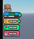
I have made uis from roblox studio and noticed that on mobile it looks very bad because on the stroke.
→ From studio

→ Mobile

Does anyone know how i could maybe fix this?
I think that you can use UIAspectRatioConstraint, idk if fix it
yeah, doesnt fix it, i think that you can make a little formula to fix with, comparing the player screen size with the border, and adjusting it
yeah i guess i could do that it is just so sad that it does that tbh
i think that you can make a table with screens sizes and uistrokes size, is just a sugestion nvm
this could help!
3 Likes
This topic was automatically closed 14 days after the last reply. New replies are no longer allowed.