And here are the new icons.
I really liked how I made the broken wand because it looks great.

There are still 10 icons left to do, but I’m tired.
Absolutely gorgeous icons, though, a “few” things:
I see some over/under fill here and there,

![]()

And, I am not really a fan of this,

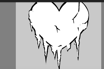
(The spikes look goofy)
Also this,

requires more cracks to it
They also look a bit tooo flat, it require more shading and depth to them.
Nitpicky things ![]() . (Sorry if I am being too nitpicky
. (Sorry if I am being too nitpicky ![]() )
)

And you don’t need a lot of shadows and so on, just this style
Hmmm yes,

one here maybe?

And the spikes.
Okay, I’ll think about it and maybe add fix it
These icons look good! Nice job on them!


